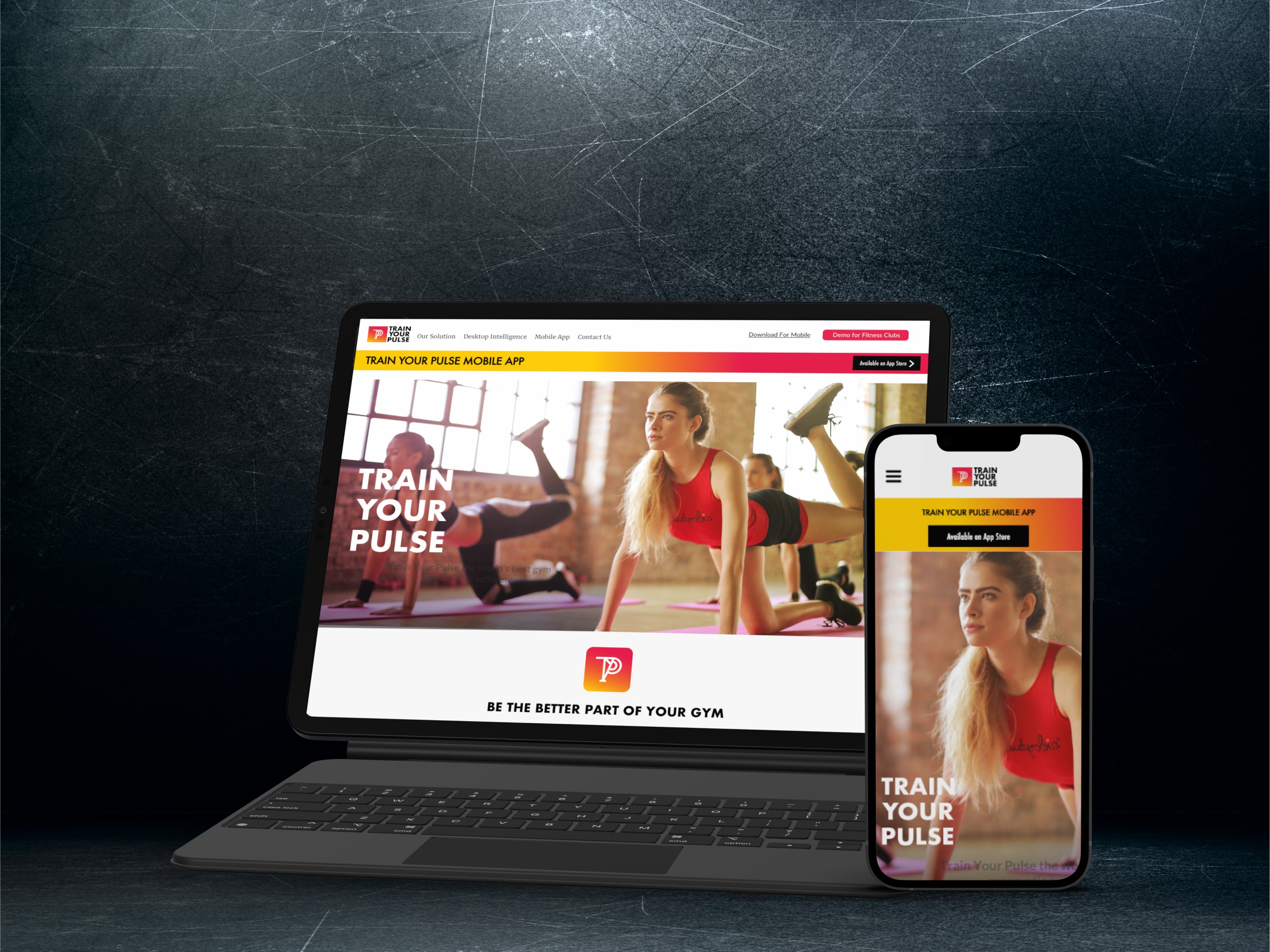
The fitness app allows users to easily book gym classes, offering a seamless and user-friendly experience. Thanks to its intuitive design and smooth functionality, the app reached #39 on the App Store, demonstrating its strong user engagement and market appeal.
The fitness app allows users to easily book gym classes, offering a seamless and user-friendly experience. Thanks to its intuitive design and smooth functionality, the app reached #39 on the App Store, demonstrating its strong user engagement and market appeal.
The fitness app allows users to easily book gym classes, offering a seamless and user-friendly experience. Thanks to its intuitive design and smooth functionality, the app reached #39 on the App Store, demonstrating its strong user engagement and market appeal.




The Problem
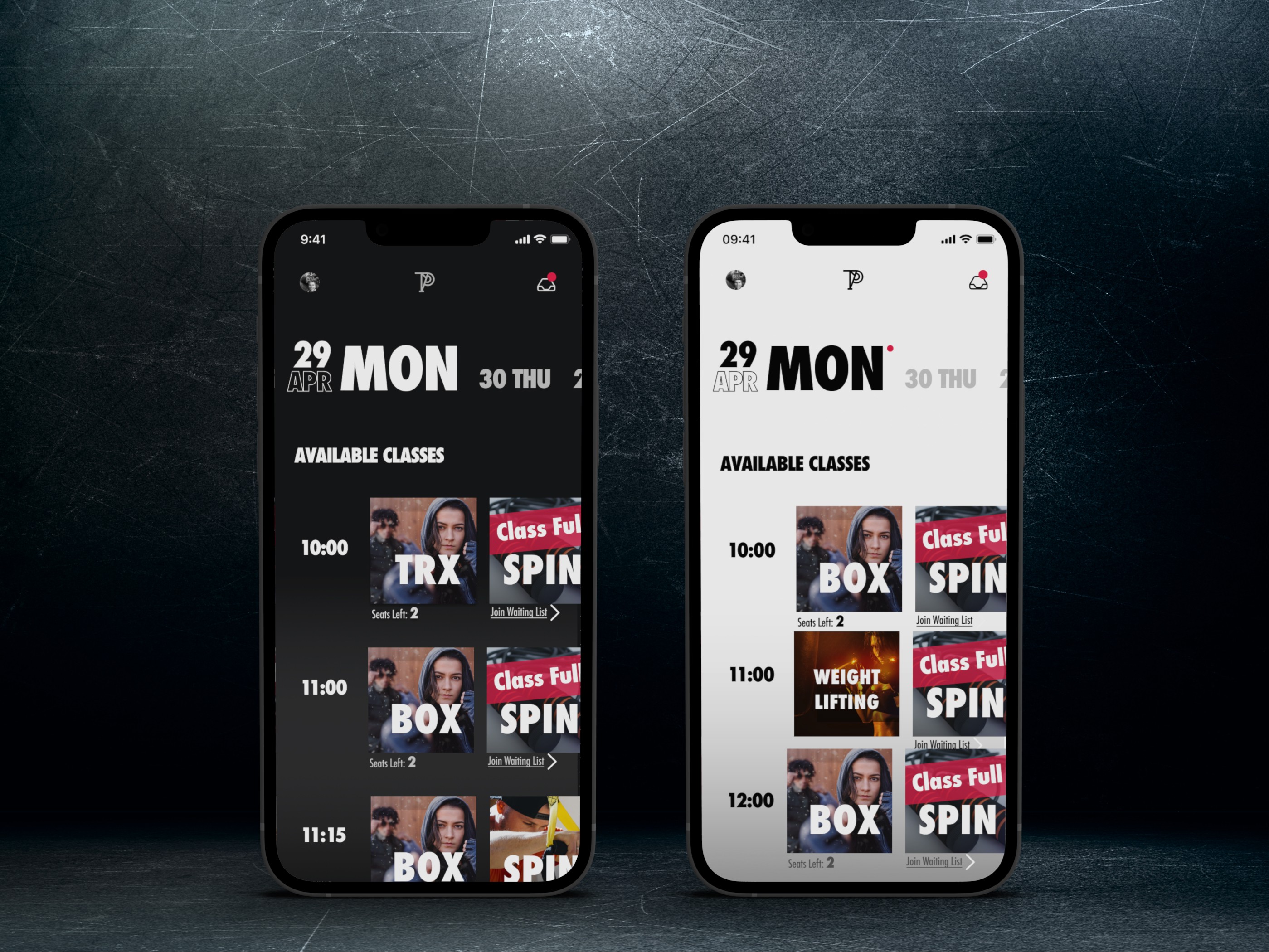
The core product idea was to simplify the process of finding and scheduling gym classes for users subscribed to specific gyms. The goal was to deliver a user experience that would strengthen the connection between gym members and the facilities, ultimately encouraging them to use the gym more frequently.
However, the existing design failed to effectively engage users and streamline class booking, leading to lower-than-expected user activity. This presented a clear need for a redesigned experience that would not only make class scheduling intuitive but also motivate users to interact with the app and the gym facilities more consistently.


Design Discovery
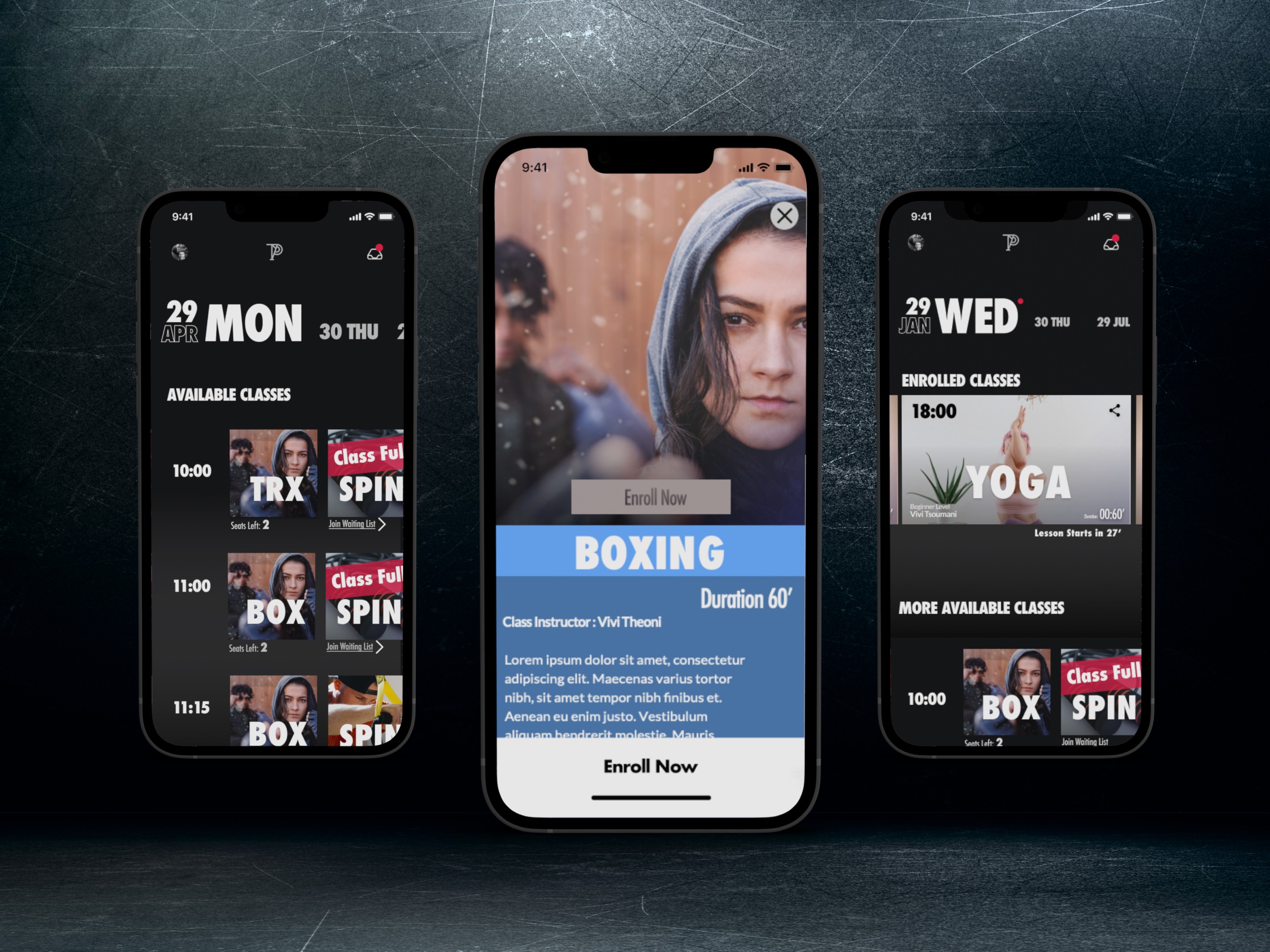
The opportunity to design a fitness app was particularly exciting for me, especially given the potential to create a seamless gym booking experience. The design brief focused on creating a user-friendly interface that allowed users to view daily gym schedules and book classes with trainers.
I began the discovery phase by diving deep into understanding the target audiences and the product’s revenue model. This step is often overlooked by many designers, but it’s critical for creating a truly successful product. A product doesn’t succeed by only satisfying user needs—it also requires an understanding of the relationships between the app’s various user groups and how they contribute to revenue generation.
“Understanding the revenue stream is a crucial step, often missed by many designers.”
Our goal was clear: to deliver a user experience that strengthened the connection between gym members and the facilities, encouraging frequent usage of subscription services. This, in turn, would boost customer retention, a key performance indicator for increasing revenue for gym owners.
As outlined in the Design Sprint book, some of my most successful designs have emerged when working under tight deadlines. This project was no exception. I started by mapping out the happy path for users and quickly built the entire user experience from there, redesigning the UX just weeks before launch.
To ensure the design met real user needs, I conducted a remote UX workshop with stakeholders. Together, we created detailed user personas, from gym members to gym owners, which allowed me to deepen my empathy for their frustrations and pain points.
Information Architecture and User Flows
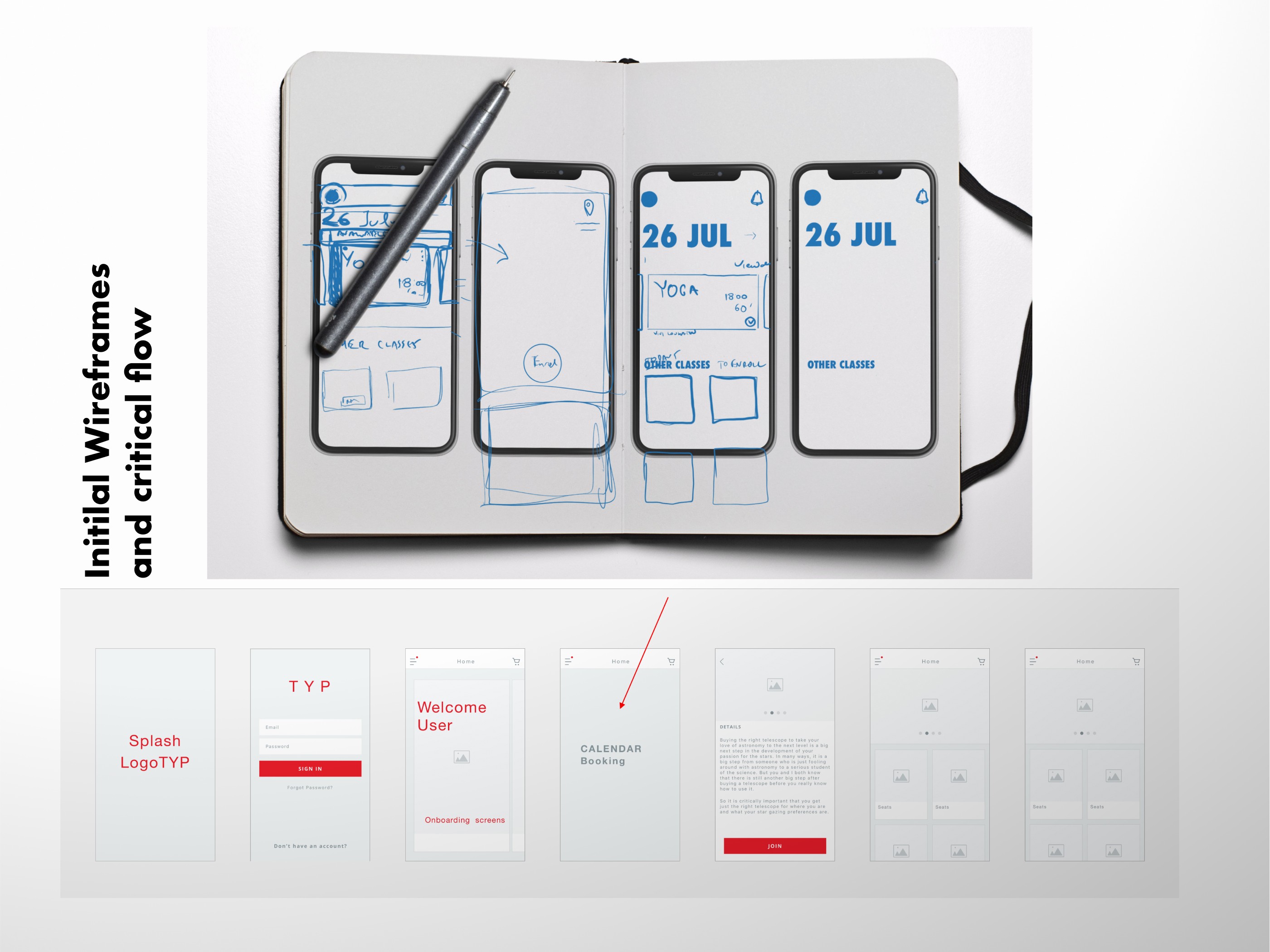
My initial approach involved sketching the core structure using Procreate on an iPad. I focused on delivering an exceptional user experience for gym members looking to book training classes. From the start, I envisioned a sleek, athletic-inspired calendar, reminiscent of Nike’s branding, even during the wireframe phase, to make the interface both functional and visually appealing.


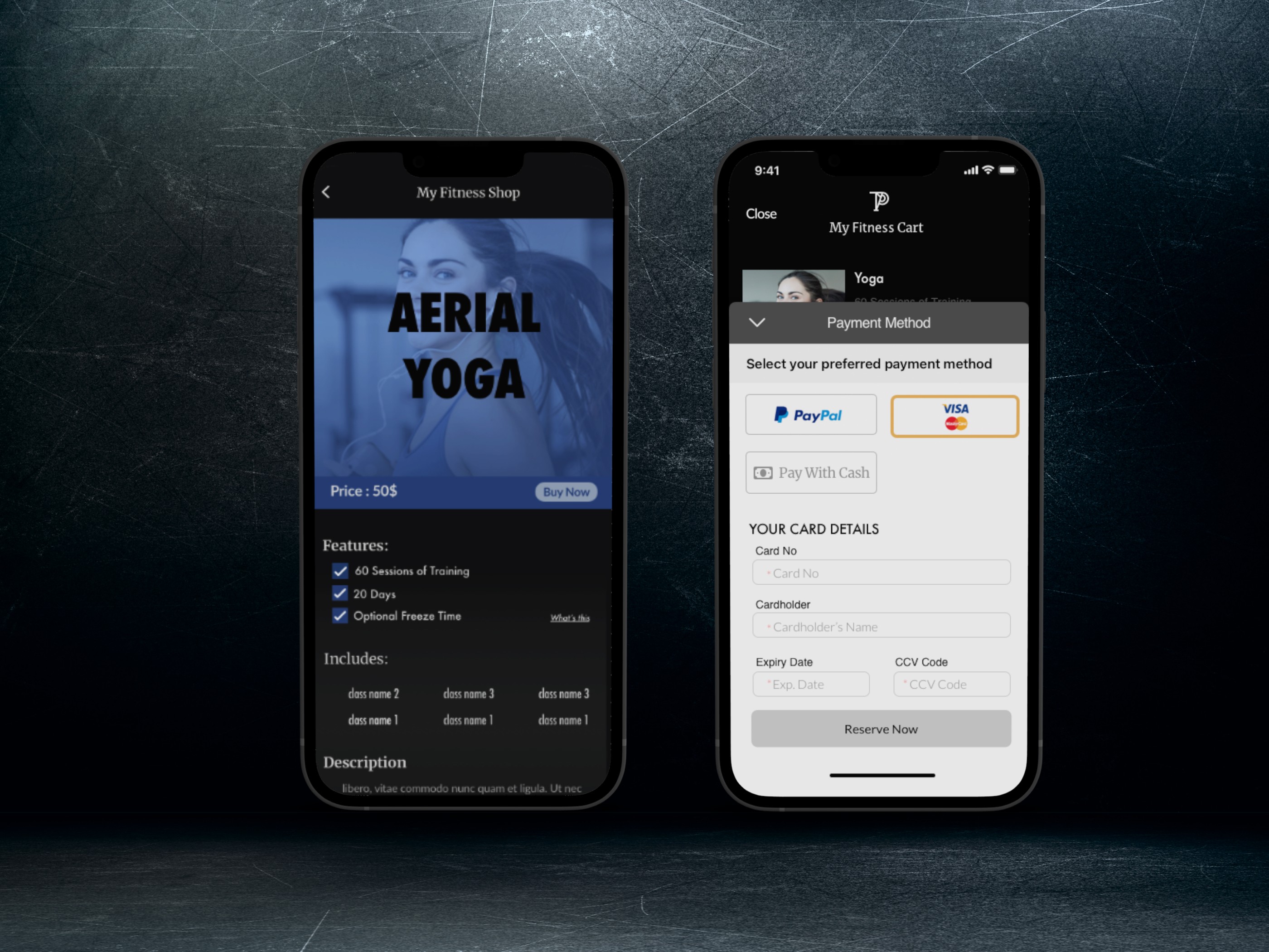


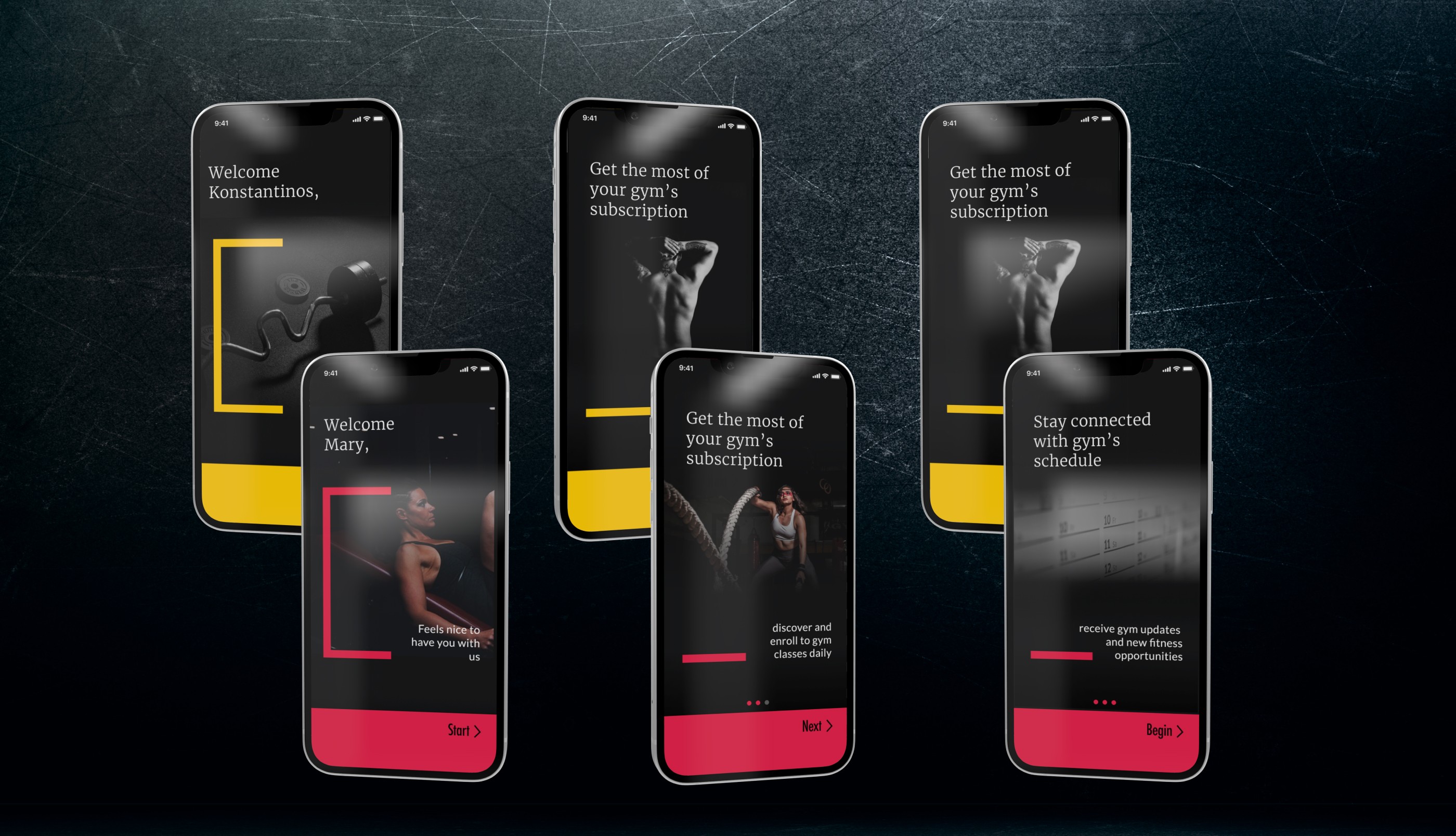


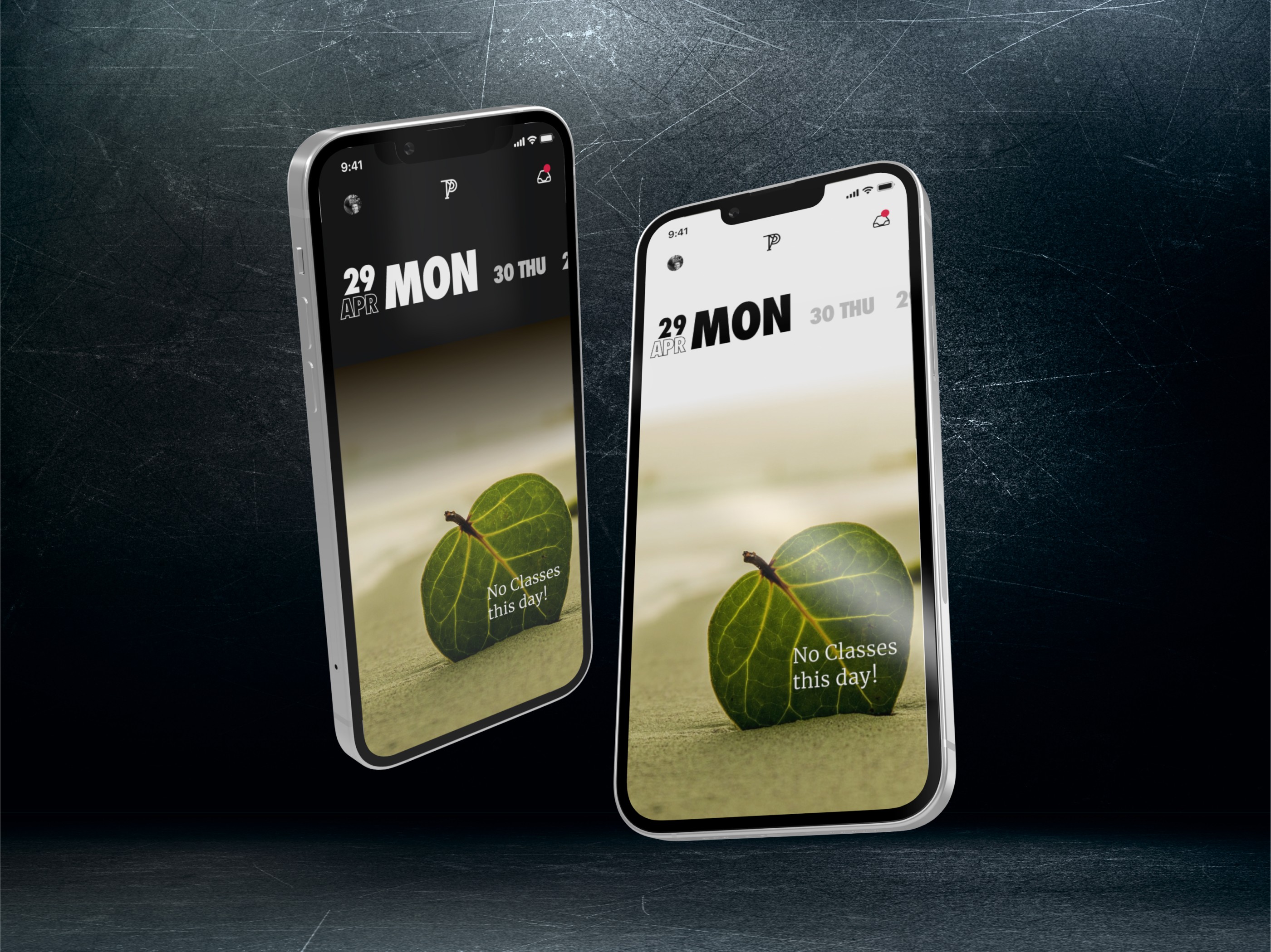
The UI design focused on delivering a vibrant, dynamic experience to engage users and streamline the booking process. Futura Bold Condensed was chosen as the primary typeface, its sleek and condensed style evoking motion and energy in alignment with the fitness-oriented theme. Bold typography ensured clarity and added a sense of action, enhancing the visual appeal while maintaining readability.
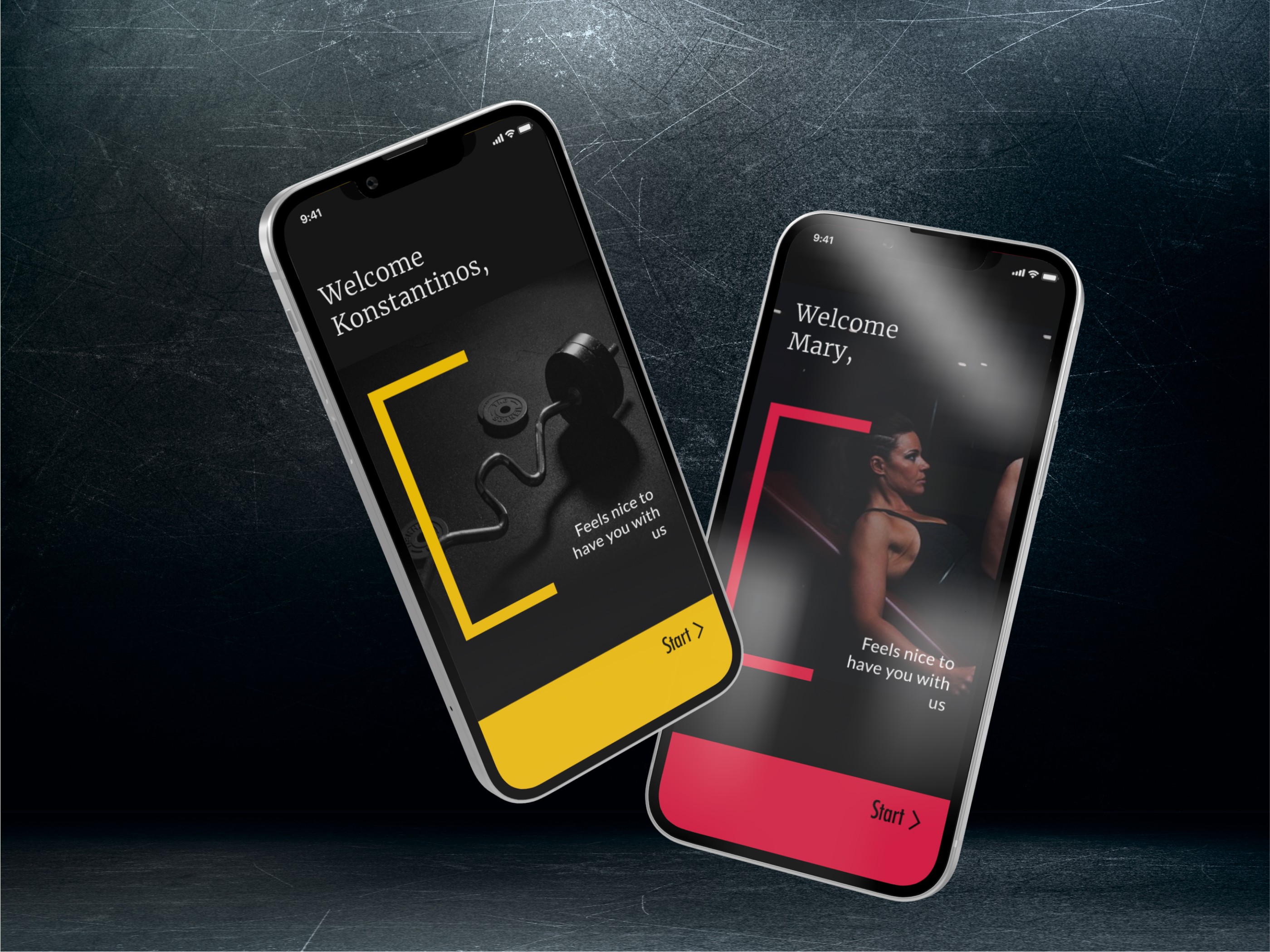
A high-saturation color palette was implemented to express vibrancy and excitement, reflecting the active nature of the app. A dark and light theme offered users a modern, customizable interface, adding a layer of sophistication and differentiation from competitors.
Bold imagery with a consistent overlay was applied across various sports, creating visual cohesion throughout the app. This approach, combined with an intuitive swiping interface, ensured a smooth and fluid user experience.
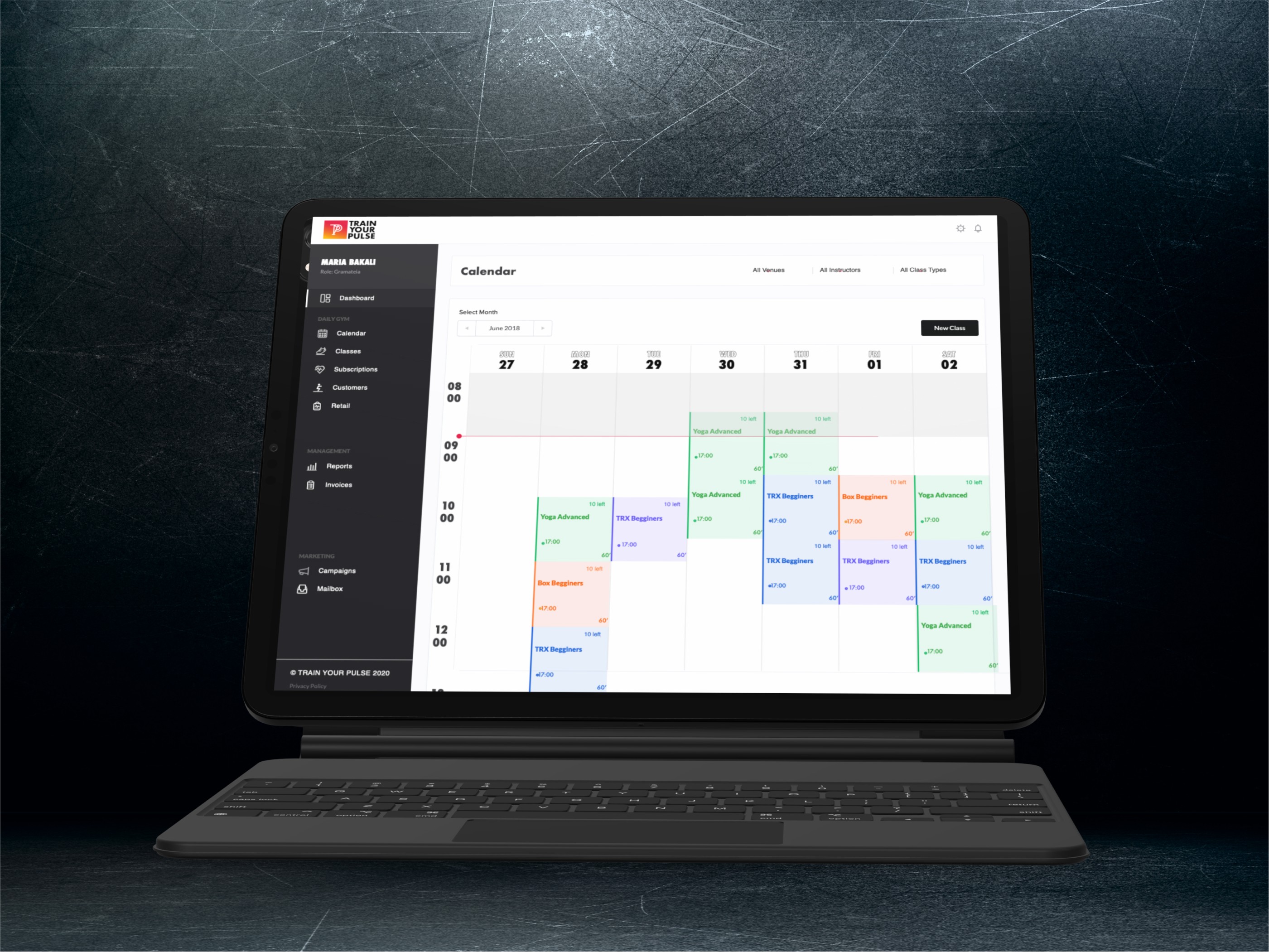
The booking calendar was designed as the central interaction point, focusing on simplicity and usability. To make it intuitive, unnecessary elements were removed, allowing users to quickly navigate through available classes and book with minimal effort. This design significantly improved the booking process, offering users a clear and seamless way to engage with the app’s core functionality.
These interaction enhancements, particularly with the booking calendar, resulted in better usability and increased user engagement.






The Design
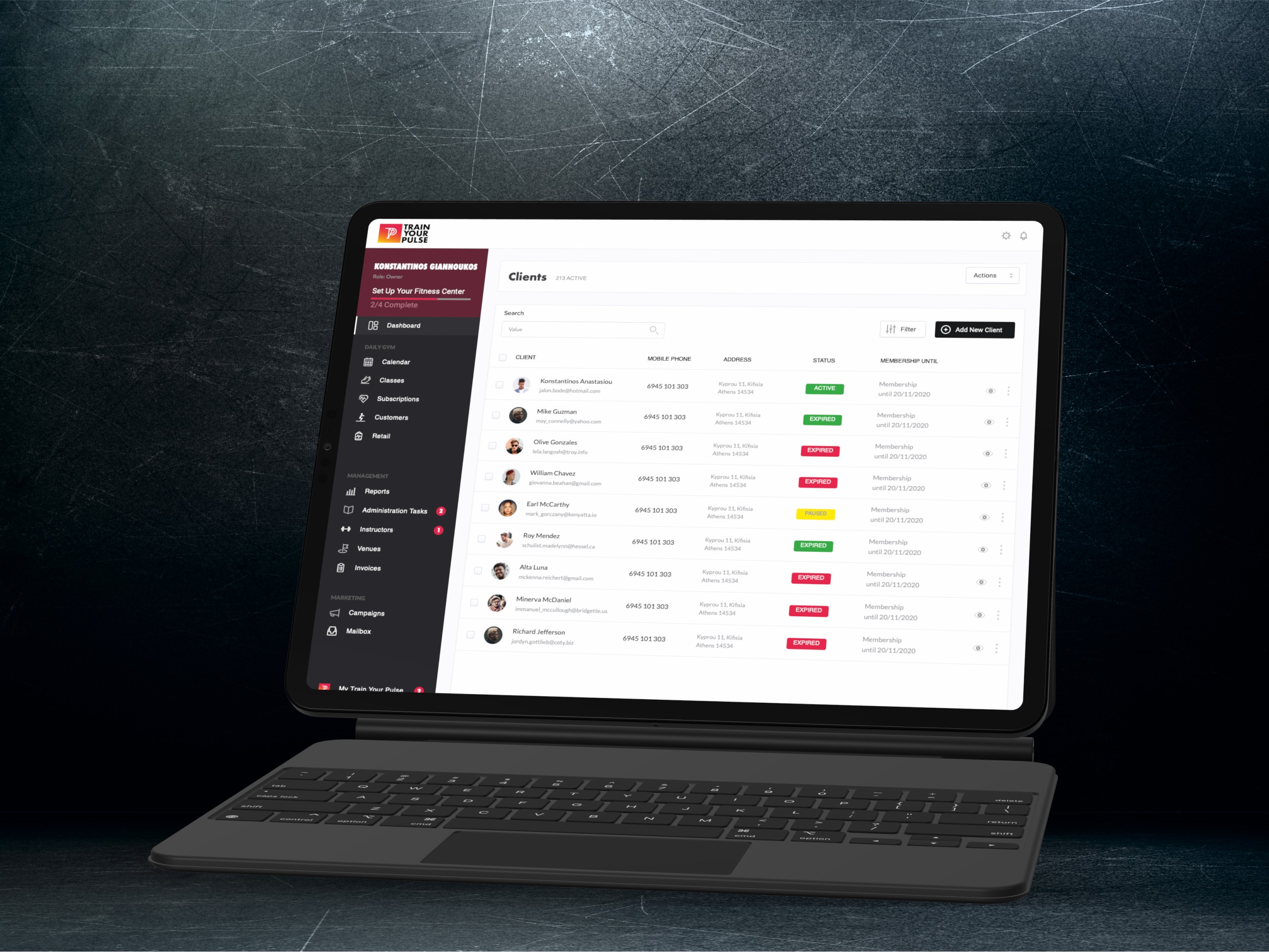
The results were impressive. Users praised the intuitive interface and actively provided feedback, which led to further refinements. The mobile app continues to be a key factor in gyms adopting the Train Your Pulse solution, cementing its role in driving customer retention and engagement. The app’s success was reflected in its ranking, reaching #39 on the App Store, a significant achievement in a competitive market.
Additionally, the solution gained further validation when it was featured as a participant on Dragons’ Den, highlighting the product’s potential and market appeal.
