Through a comprehensive heuristic evaluation of TrainOSE’s existing platform, it became clear that the system scores low in several fundamental usability principles. Issues such as inconsistent navigation, lack of error prevention mechanisms, poor visibility of system status, and a mismatch between the system’s language and real-world conventions are prevalent. These deficiencies lead to user confusion, increased errors, and a frustrating experience when attempting to purchase tickets or access travel information. This low usability score underscores the urgent need for a redesign to address these critical problems and enhance the overall user experience.
Through a comprehensive heuristic evaluation of TrainOSE’s existing platform, it became clear that the system scores low in several fundamental usability principles. Issues such as inconsistent navigation, lack of error prevention mechanisms, poor visibility of system status, and a mismatch between the system’s language and real-world conventions are prevalent. These deficiencies lead to user confusion, increased errors, and a frustrating experience when attempting to purchase tickets or access travel information. This low usability score underscores the urgent need for a redesign to address these critical problems and enhance the overall user experience.
Through a comprehensive heuristic evaluation of TrainOSE’s existing platform, it became clear that the system scores low in several fundamental usability principles. Issues such as inconsistent navigation, lack of error prevention mechanisms, poor visibility of system status, and a mismatch between the system’s language and real-world conventions are prevalent. These deficiencies lead to user confusion, increased errors, and a frustrating experience when attempting to purchase tickets or access travel information. This low usability score underscores the urgent need for a redesign to address these critical problems and enhance the overall user experience.
Role
Junior UX / UI Designer
Client
Capstone Project
Year
2019
Services


The Problem
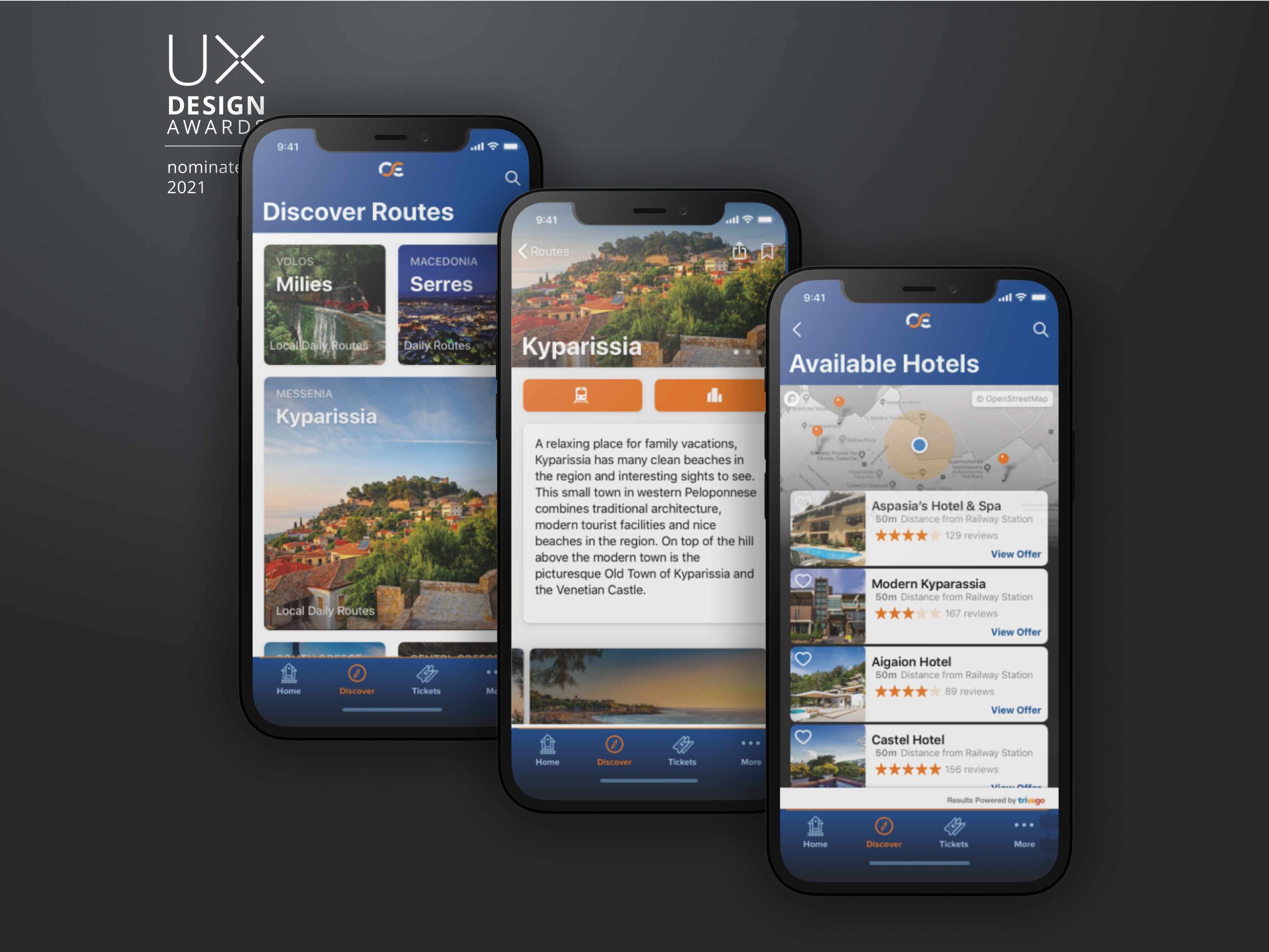
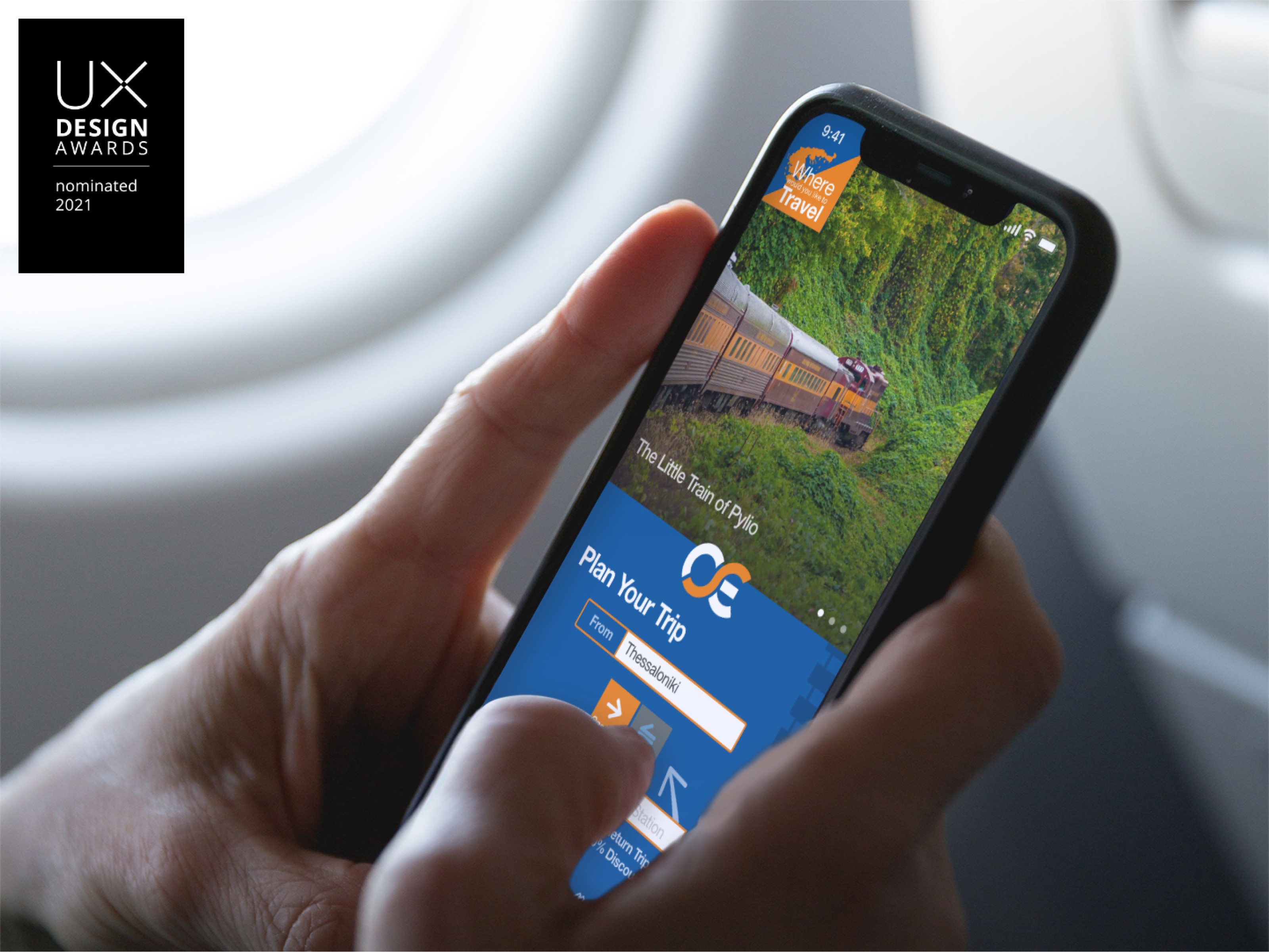
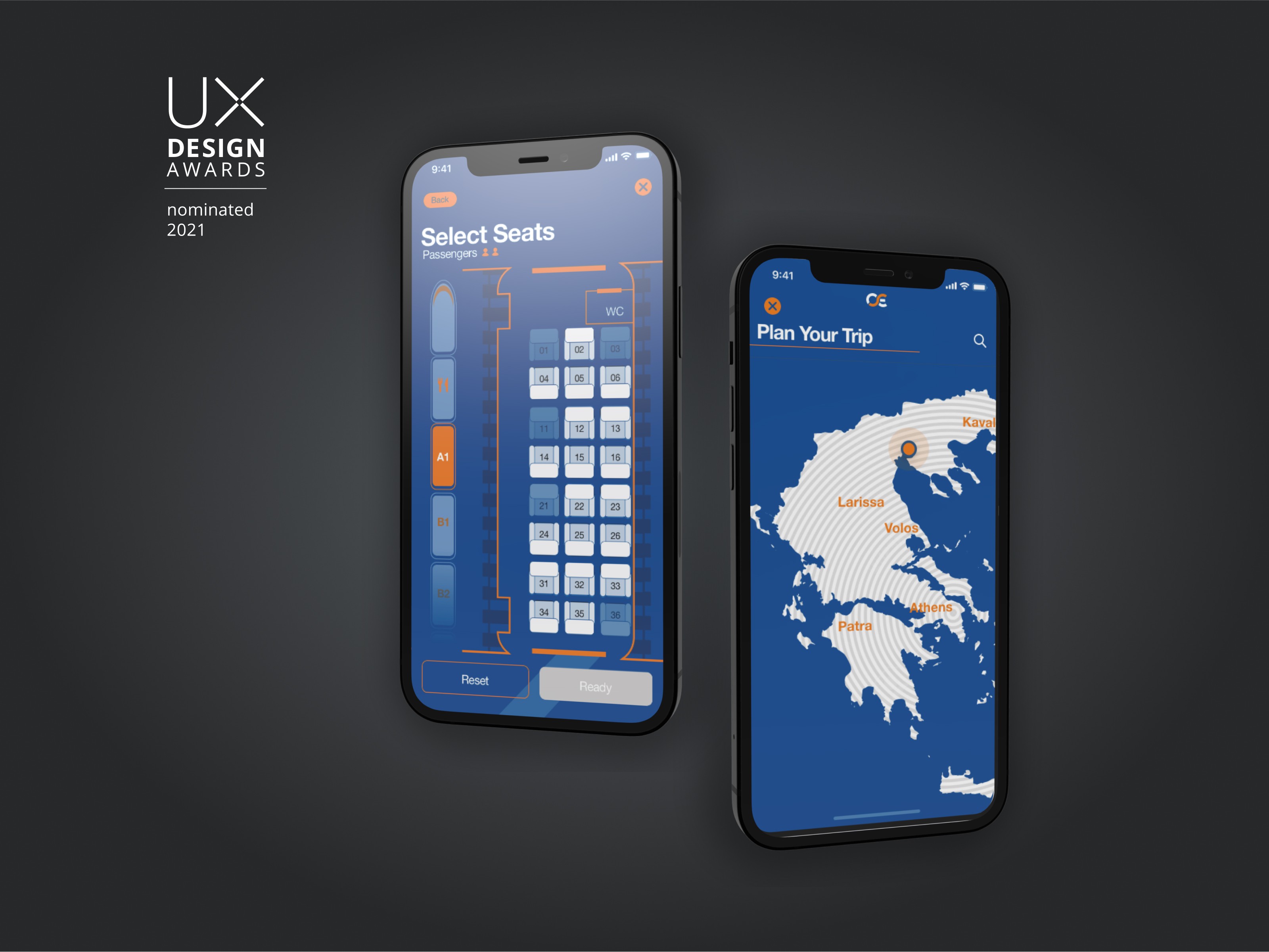
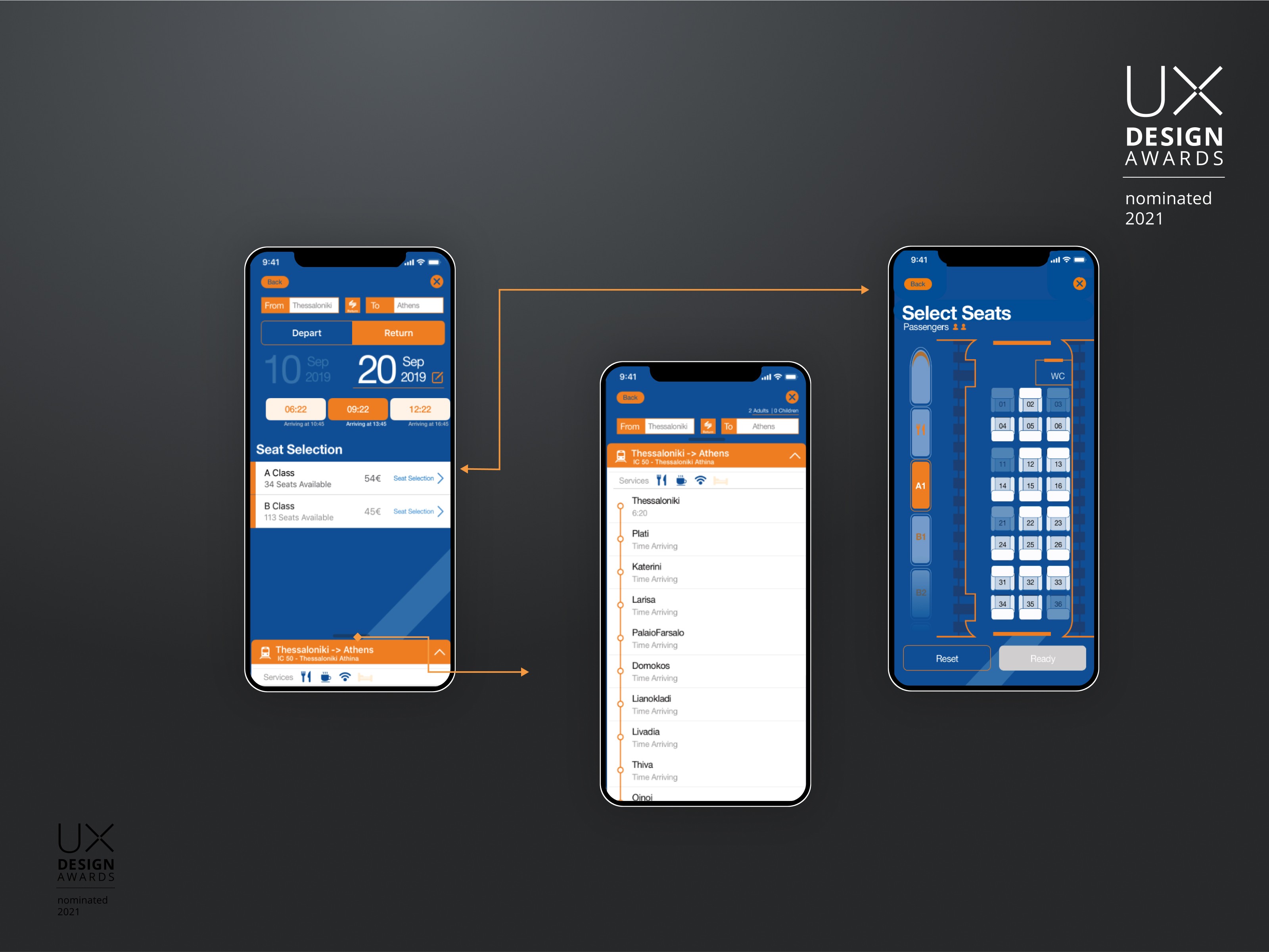
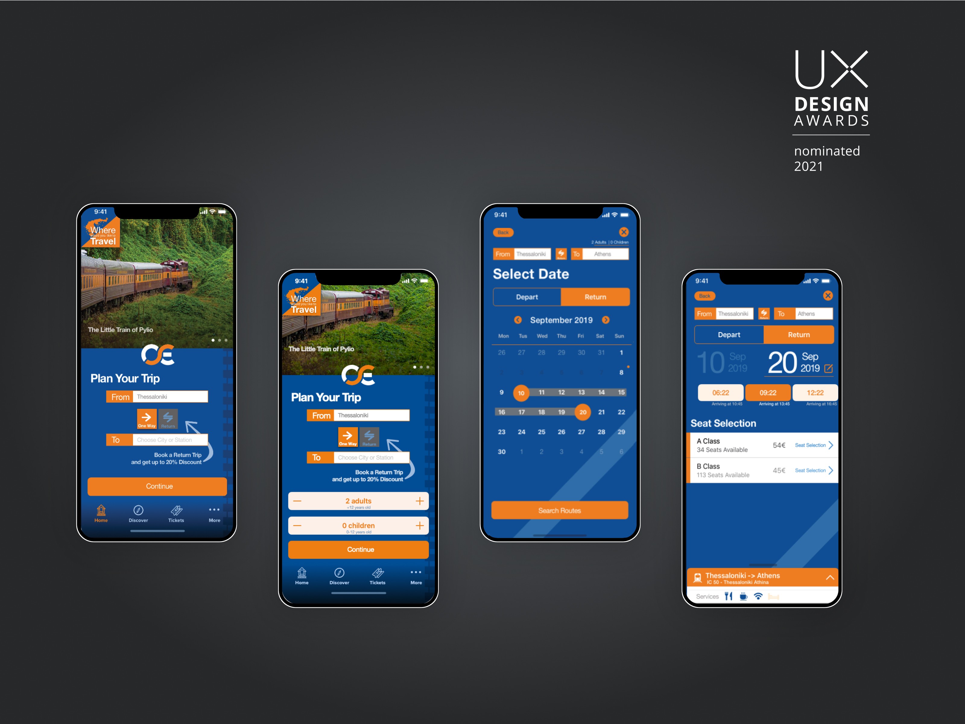
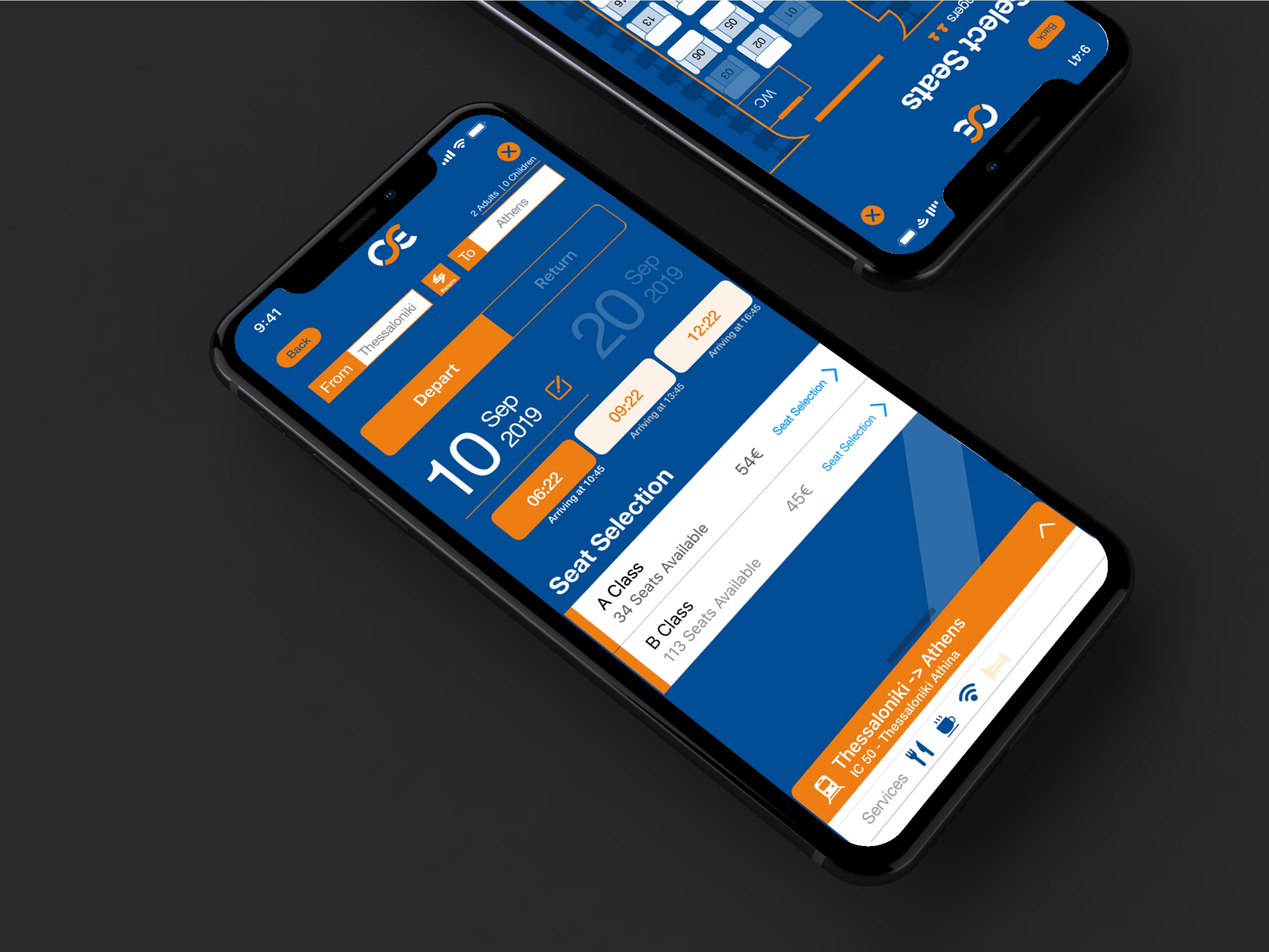
Rethink TrainOSE is a concept app created as a capstone project. This product is a railway ticketing application. The user can book tickets, pick selected seats and explore train facilities like WIFI or breakfast. Also, the user can explore locations in Greece visitable by train, and plan more complex tips with intermediary stops. The complete UX checkout process is included with the prototype. The user can add the tickets bought in the apple wallet but also, view them inside the app.


UX Research
Cognitive Walk-through & Heuristic Evaluation
Initially, I conducted a cognitive walk-through analysis and heuristic evaluation in existing TRAINOSE Website, and ticket purchasing process. By evaluating the existing solution gaps and discussing them with users, improvements that reflect existing user problems can be better solved.
User Interviews
Series of semi-structured interviews with users. This enabled me to better understand the user needs, the various user flows on how they purchase tickets, the issues they face when selecting railway tickets and things they like on various solutions.
User Personas
Multiple Personas were created following the user research and interviews to better empathize with their behaviors and motives.
Information Architecture & User Flow
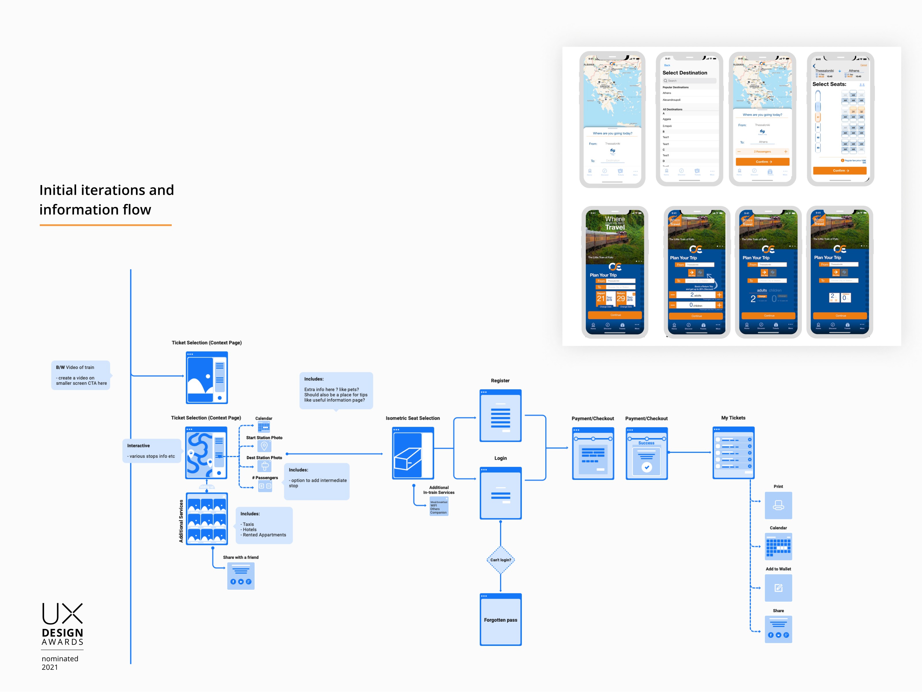
User personas were used to design user flows and deliver a consistent Information Architecture. The Information Architecure was tested with the users through Optimal Workshop. The scenarios used to test the IA were as follows
You want to buy a ticket
You want to discover the routes"
How do you file a complaint”
Free browsing. What are you looking for?
View Information Tree on Optimal Workshop >
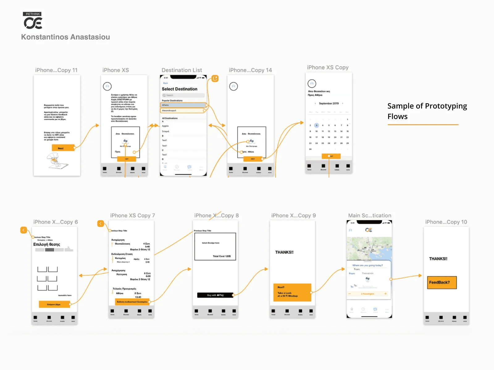
Wireframes
The results were essential for planning the ticket purchase process. Finally, as it turned out, the most important thing for someone to browse the trainOSE site is itinerary searches and ticket purchases.
The second very important element is to easily locate the tickets when in need because this action can be done under a state of psychological pressure for the user (especially on mobile).
Third and last is the possibility of direct communication with the call center, a need that gives a sense of security to the user and is imposed to facilitate customer support.
View Lo-Fi Prototype on Marvel →






UI Design
Initial UI design was white. It worked aesthetically but after consulting with "friends and family", co students and my professor the need to "push" more on the visual aesthetics and design options came up.
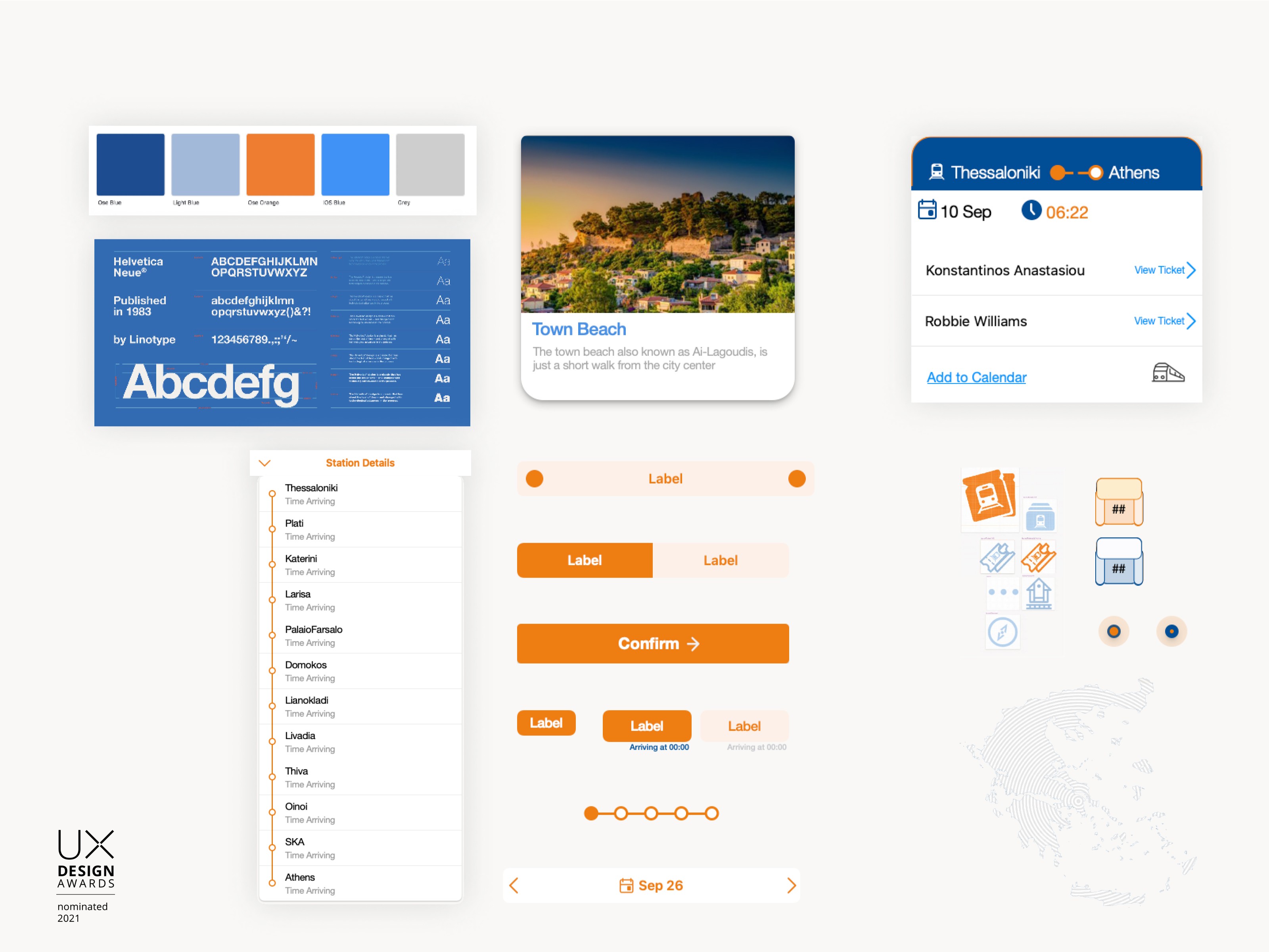
Typeface Selection
Helvetica was the way to go for choosing a font family. Many consider Helvetica a bona fide celebrity of the type world.
Inspired from worldwide signage language. The typeface’s neutrality is what makes it go unnoticed most of the time, despite being liberally splashed across what feels like every sign, sticker and poster in many Western cities.
Colors and Iconography
The colors respect the existing company branding. Graphical elements were designed compliant with the existing design scheme to ensure continuity.
Custom Map and UI Interactions
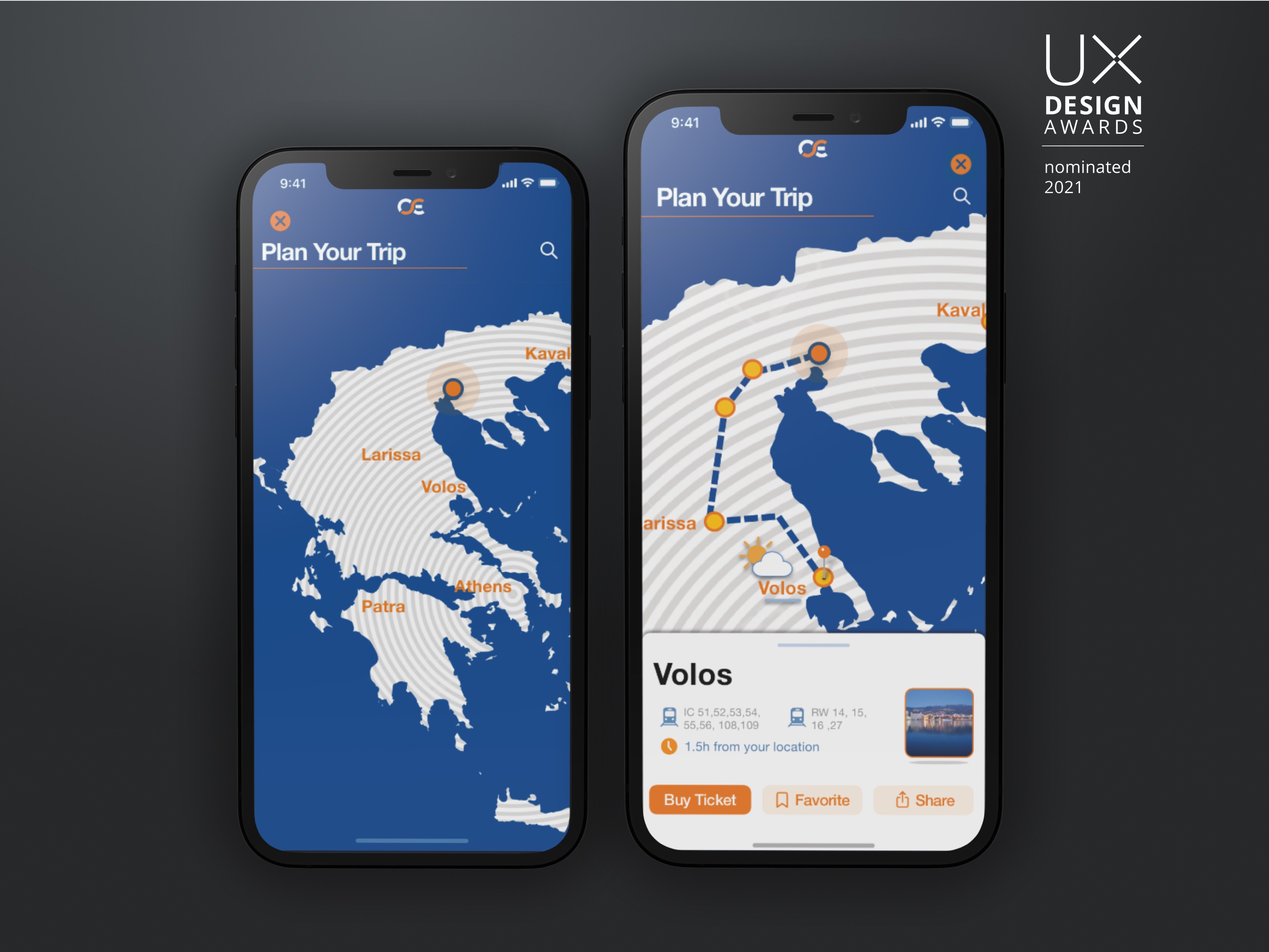
Map is essential for understanding the routes and the research showed it was extremely important for tourists. To help the user focus and relieve the noise of irrelevant information a special map of Greece was designed






The Impact
This proposal makes current the digital footprints of this company, empowering users and offers a complete solution tailored to their wishes.
The biggest gain from the process was the research and the fact that continuous iterations improved the final result of the design proposal. No one can claim that this proposal is not subject to an improvement, the capstone's available resources, schedules, and constraints affected the final result.
Another important part of the user experience is the micro-interactions shown inside the live demo, making it more lively.
The writing of the present dissertation and the whole evolutionary process evolved me as a designer but also as a user experience analyst, opening new horizons for the future.


