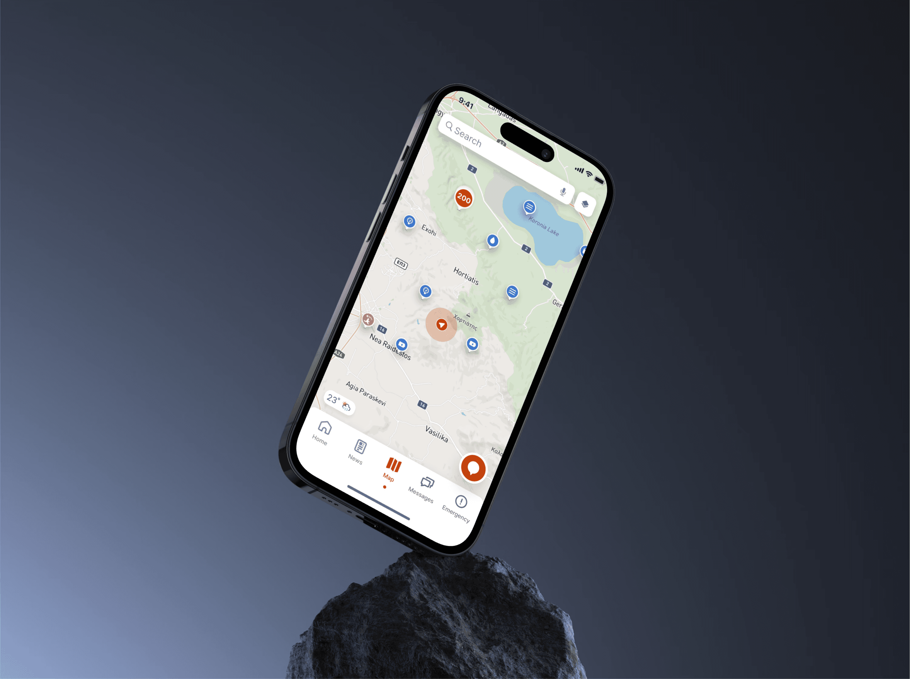
Sealoc is a nautical weather and sea forecast app designed for mobile and desktop, targeting small business users. It delivers real-time updates on weather and sea conditions for a variety of activities, including tourism, fishing, and aquaculture. Built with ease of use in mind, Sealoc enables users to make informed decisions while navigating the seas, enhancing safety and efficiency across multiple industries.
Sealoc is a nautical weather and sea forecast app designed for mobile and desktop, targeting small business users. It delivers real-time updates on weather and sea conditions for a variety of activities, including tourism, fishing, and aquaculture. Built with ease of use in mind, Sealoc enables users to make informed decisions while navigating the seas, enhancing safety and efficiency across multiple industries.
Sealoc is a nautical weather and sea forecast app designed for mobile and desktop, targeting small business users. It delivers real-time updates on weather and sea conditions for a variety of activities, including tourism, fishing, and aquaculture. Built with ease of use in mind, Sealoc enables users to make informed decisions while navigating the seas, enhancing safety and efficiency across multiple industries.
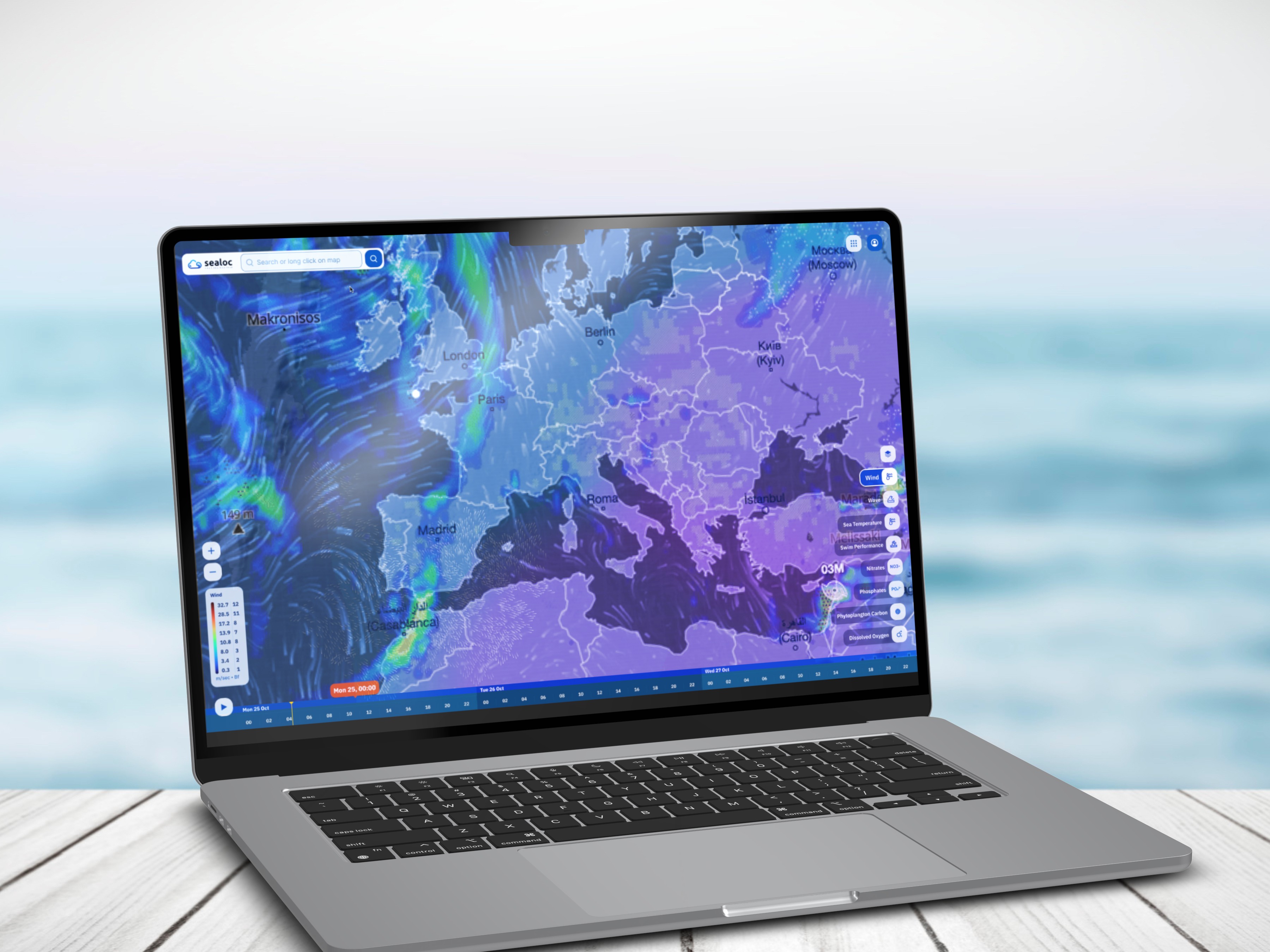


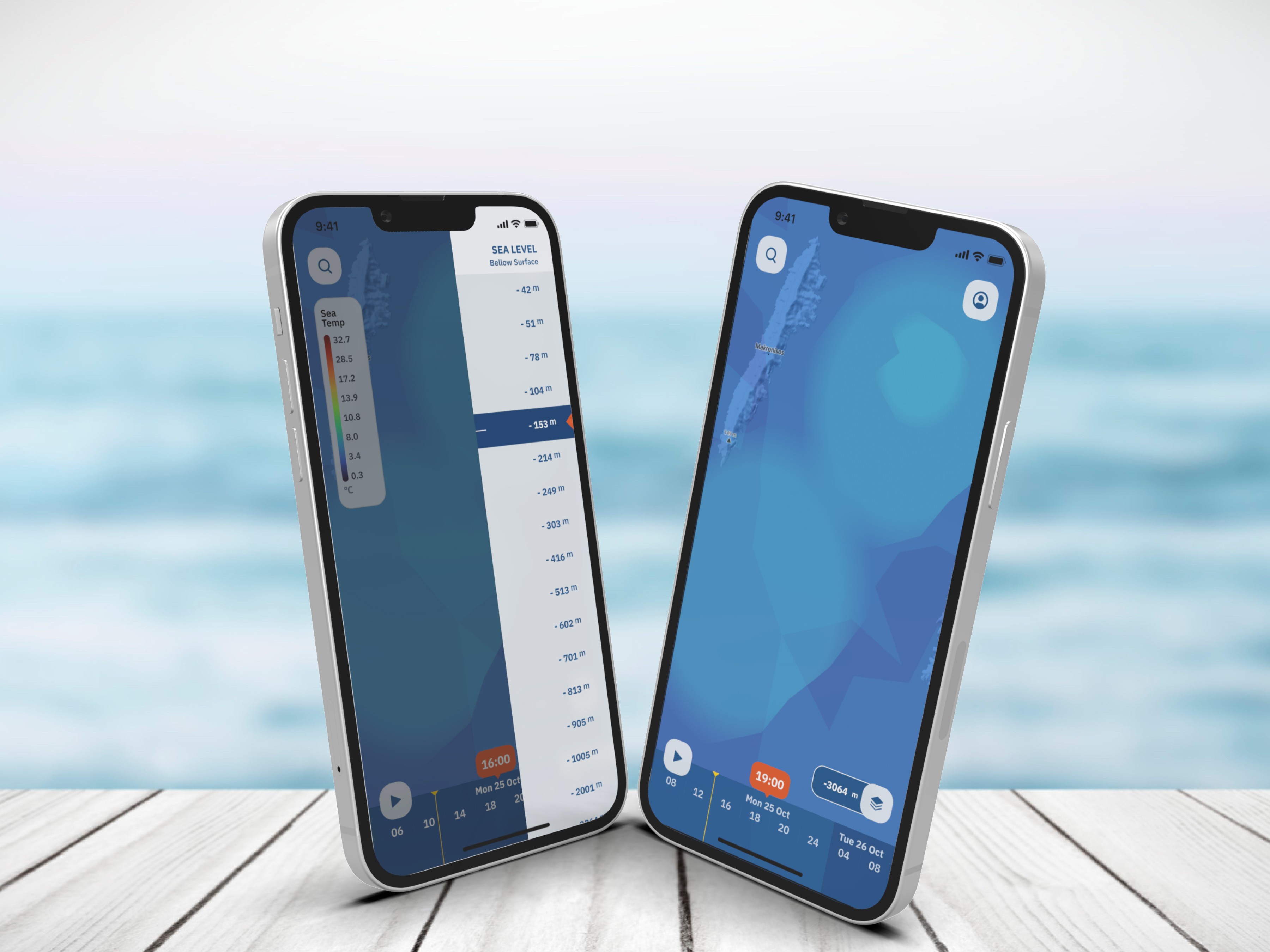


The Problem
Sealoc aimed to provide professional users with detailed metrics across multiple depth levels. The target audiences included fishermen, fish farming experts, and skippers in the Mediterranean region, each requiring real-time data for their operations.
The solution needed to include both a mobile app and a desktop web view, with the mobile app leveraging modern technologies such as location-based services and push notifications. Additionally, the business model required a subscription-based paywall, offering a limited set of metrics for free users while reserving more advanced features for paying subscribers.
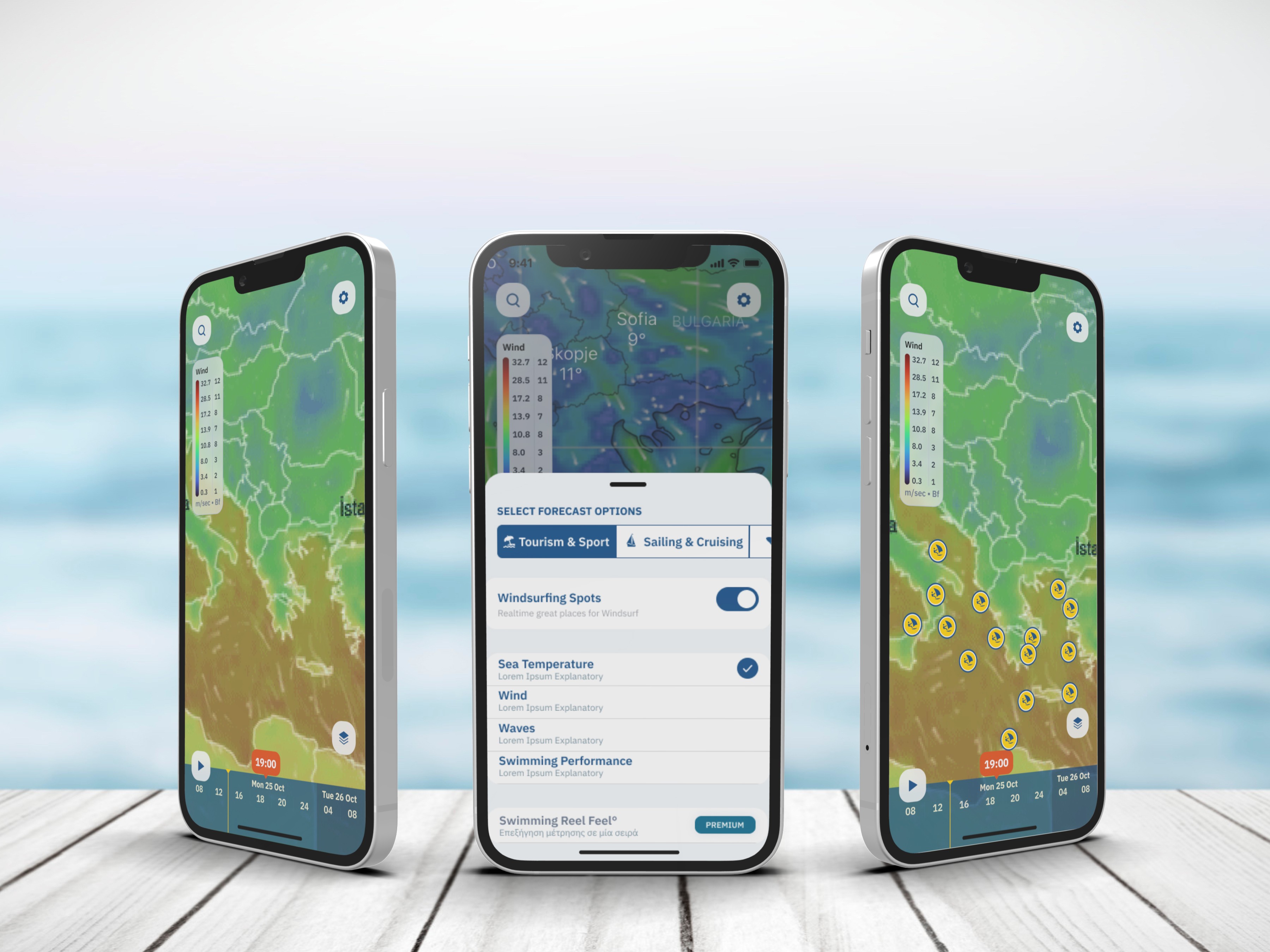


The Sollution
Discovery
In line with design thinking principles, the process began with a deep understanding of the key audiences the product needed to address. Fortunately, the team had already established a solid business direction and monetization model through third-party marketing services.
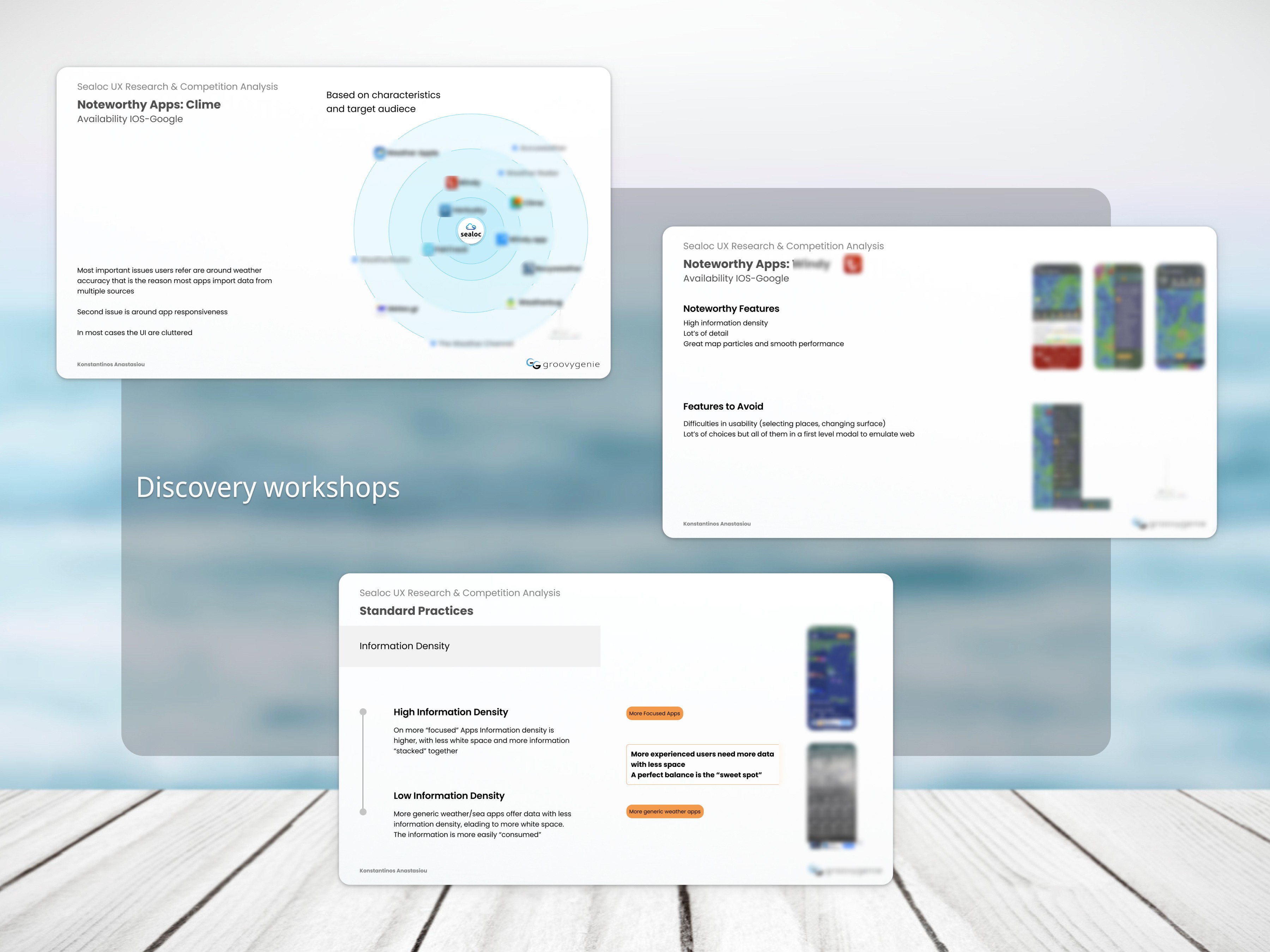
Building on that foundation, I coordinated workshops to transform the existing marketing personas into UX personas. This process helped the team gain deeper insights into how users interact with similar apps, directly influencing the design process. For instance, we carefully considered information density during the UI design phase, ensuring the interface remained clear and intuitive for users.
Competition Analysis
The next step was analyzing how competitors approached similar user problems. Following Jakob’s Law, I studied existing solutions, identifying areas for improvement and weaknesses in competitors’ designs. It’s fascinating how much can be learned by evaluating both visually appealing and less aesthetically refined designs.
Jakob’s Law: “Users spend most of their time on other sites. This means that users prefer your site to work the same way as all the other sites they already know.”
This analysis was shared with the team in workshops, enabling us to prioritize features in the backlog and fine-tune the product’s market positioning. By identifying competitor weaknesses, we could prioritize features the engineering team could deliver more effectively, giving Sealoc a competitive edge.
Information Architecture
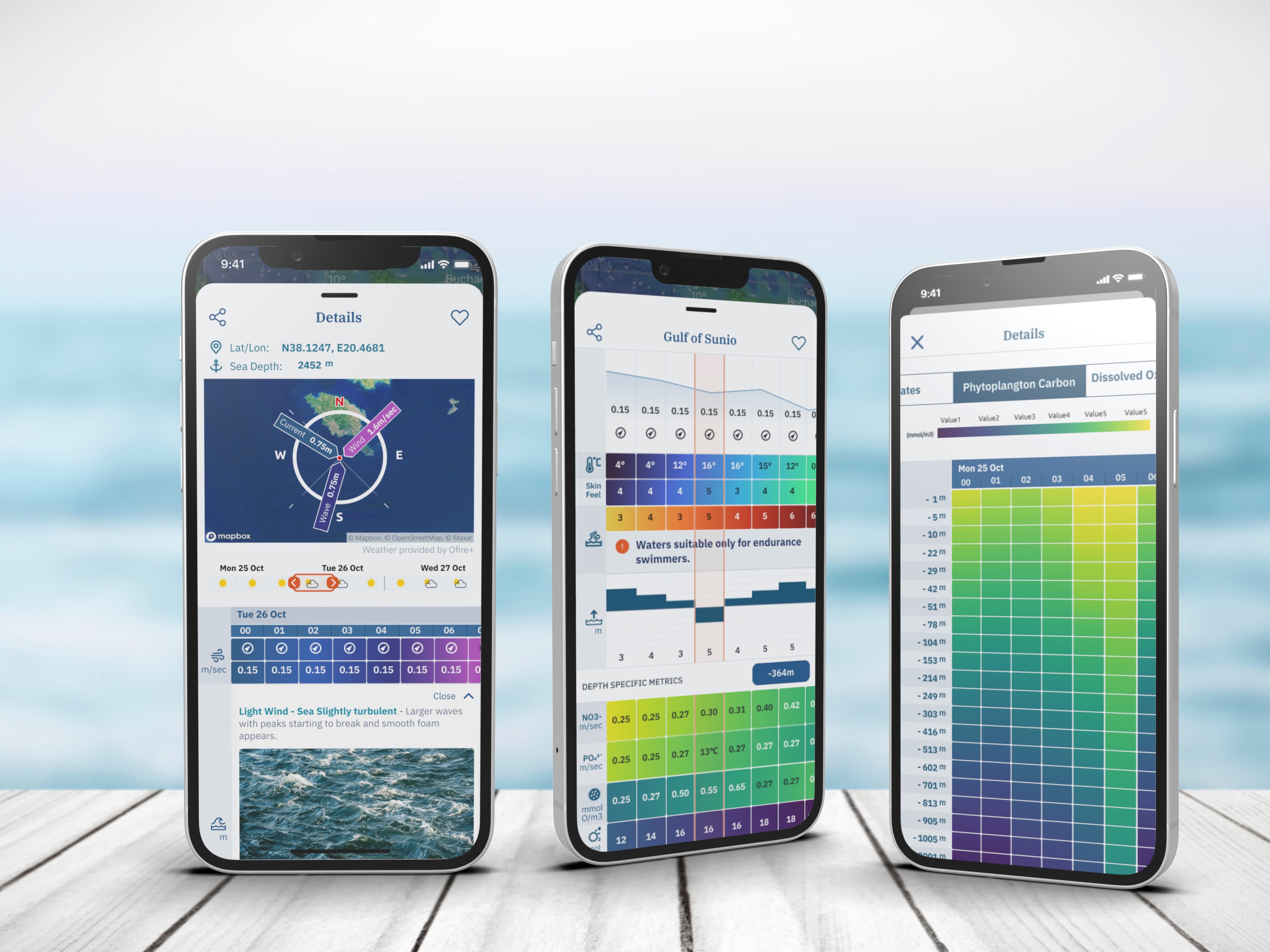
In data-heavy products like Sealoc, information architecture (IA) is critical and involves two stages. First is the System IA, which defines the hierarchy and location of each element in the product. The second is Data IA, which structures how metrics are organized and nested, shaping the data visualization strategy early in the process. For Sealoc, this strategic approach to IA was essential in ensuring that complex data was presented in a user-friendly and meaningful way.
Building on the outcomes of the initial research and competitive analysis, I synthesized the findings to form assumptions that guided workshops with the product team. These workshops allowed us to iteratively develop lean user flows for each specific use case, ensuring that the workflows aligned with user needs and business goals.
Wireframes Alignment
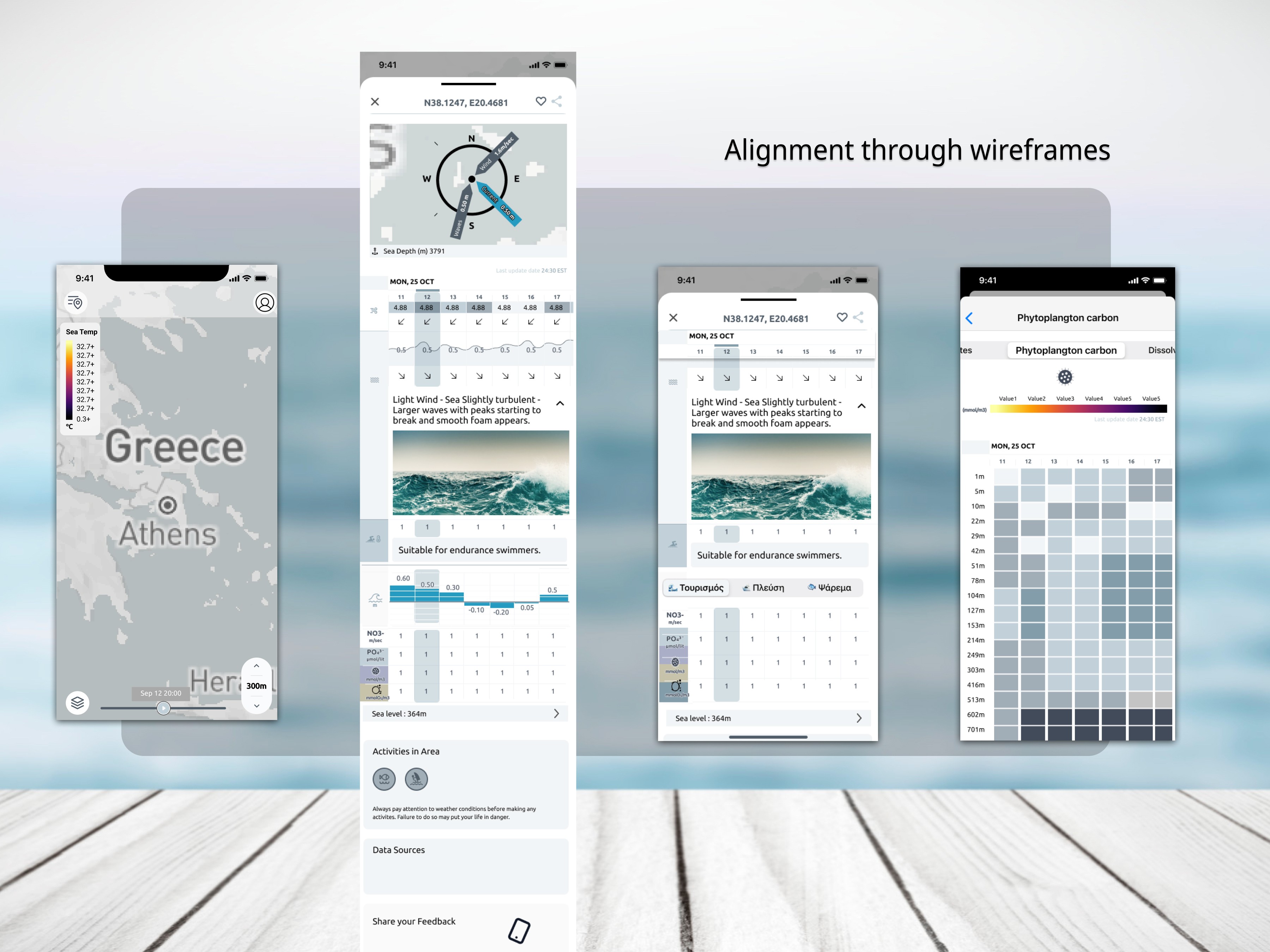
While the user flows themselves were free of graphical elements, the wireframes introduced a layer of design detail. This was necessary because early decisions had to be made regarding data visualization and key interactions within the app. By incorporating some design elements at this stage, we were able to address critical visual and functional considerations early in the process, ensuring smoother transitions into the later design phases.






The Design
UI Design
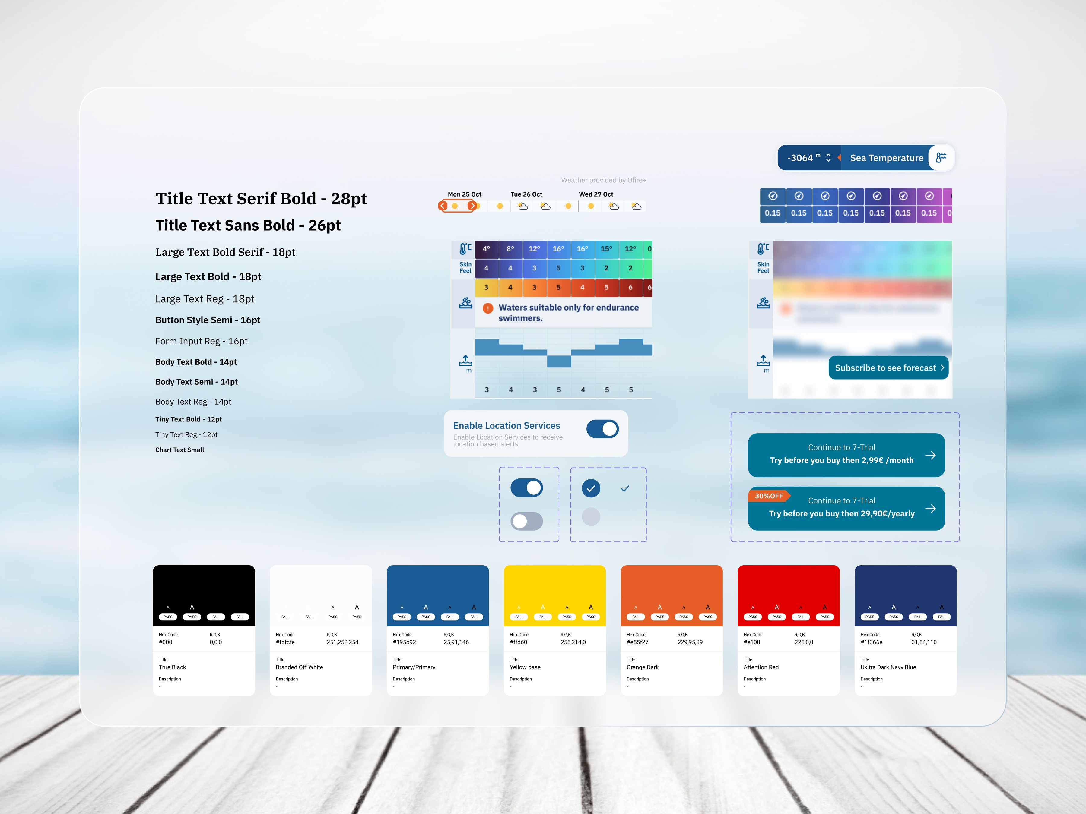
The UI design was crafted with scalability and precision in mind, backed by a robust design system that allowed seamless adaptation across mobile and desktop platforms. Every detail was carefully considered, recognizing that users often equate aesthetic quality with usability. As a result, pixel-perfect, high-fidelity designs were delivered to developers, ensuring flawless implementation and a premium user experience.
Microinteractions
Microinteractions were key to enhancing the app’s overall usability and delight. Prototyped in Figma, these interactions not only engaged the development team but also ensured seamless alignment between design intent and technical execution. Every interaction—particularly those surrounding data visualization and information consumption within a progressive UI—was meticulously documented. These subtle, yet powerful touches enriched the user journey, making the app both intuitive and engaging.
Colors
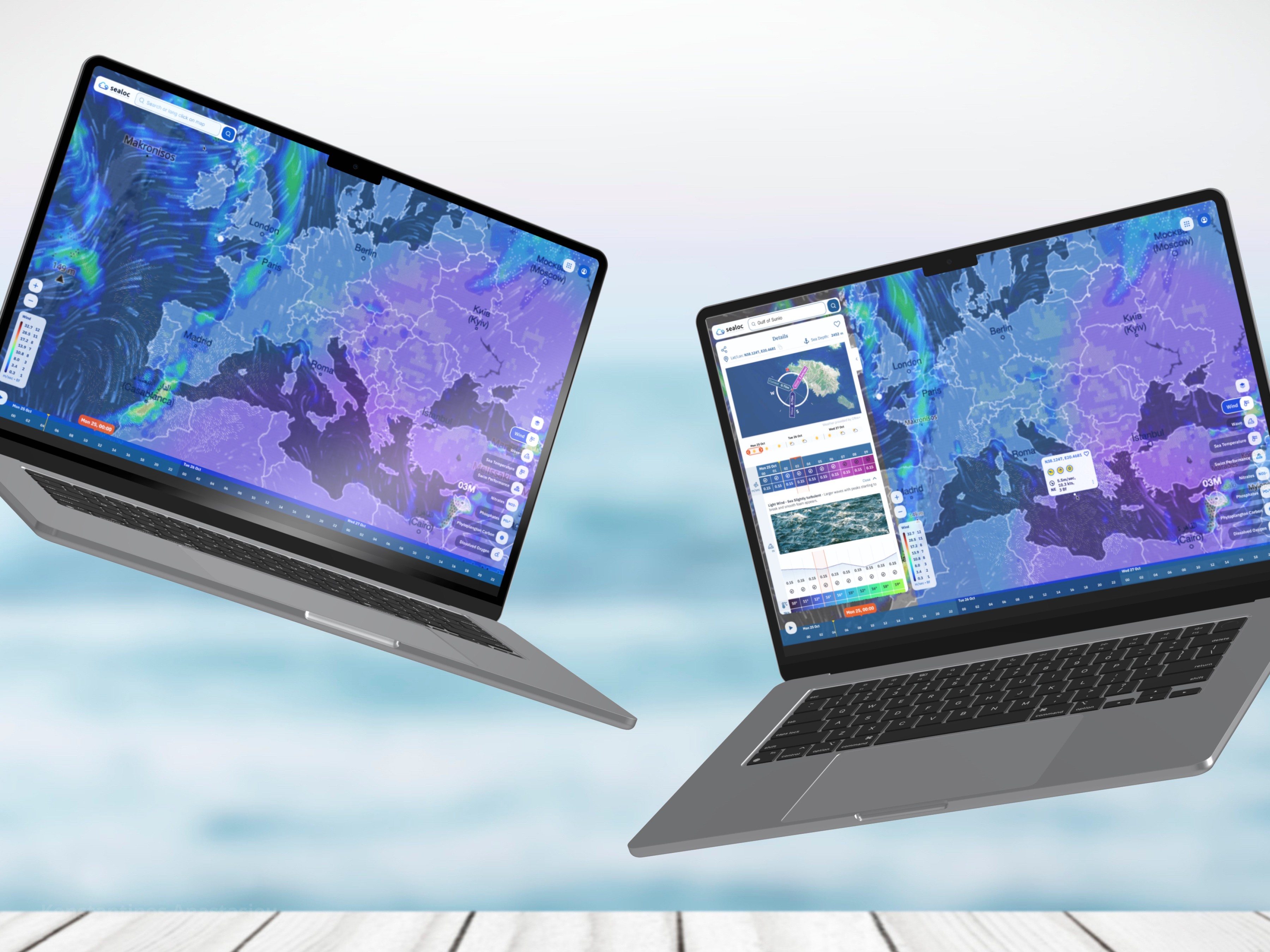
Color played a pivotal role in the app’s data visualization strategy. The chosen palette was intentionally vibrant, using highly saturated colors to enhance clarity and readability, especially in outdoor environments where direct sunlight could hinder visibility. This decision was grounded in research, ensuring the app remained effective in real-world conditions, where less saturated colors would have been insufficient.
Information Density & Whitespace
Through user research, it became clear that the target audience—mostly professionals—required more metrics in less space. To meet these needs, the design embraced higher information density, reducing whitespace while maintaining clarity and ease of use. This approach was rigorously tested, and users praised the ability to quickly digest complex data without sacrificing usability.
Accessibility Compliance
Strict WCAG 2.0 guidelines were followed to ensure the app was fully accessible to all users. Every interaction, font choice, and color contrast was designed with accessibility in mind, guaranteeing that the app could be used by a wide range of individuals without compromise.
Paywall & Onboarding
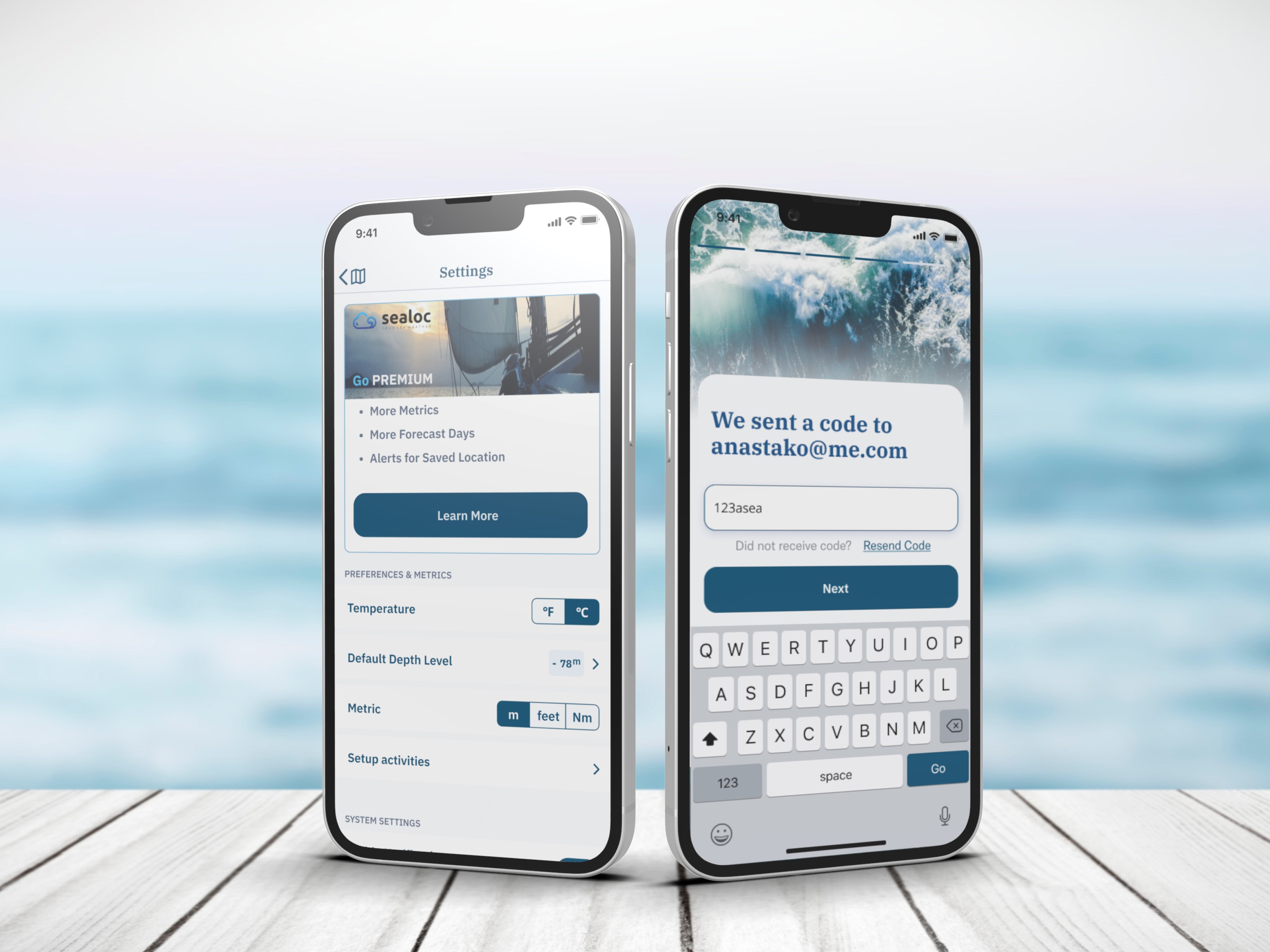
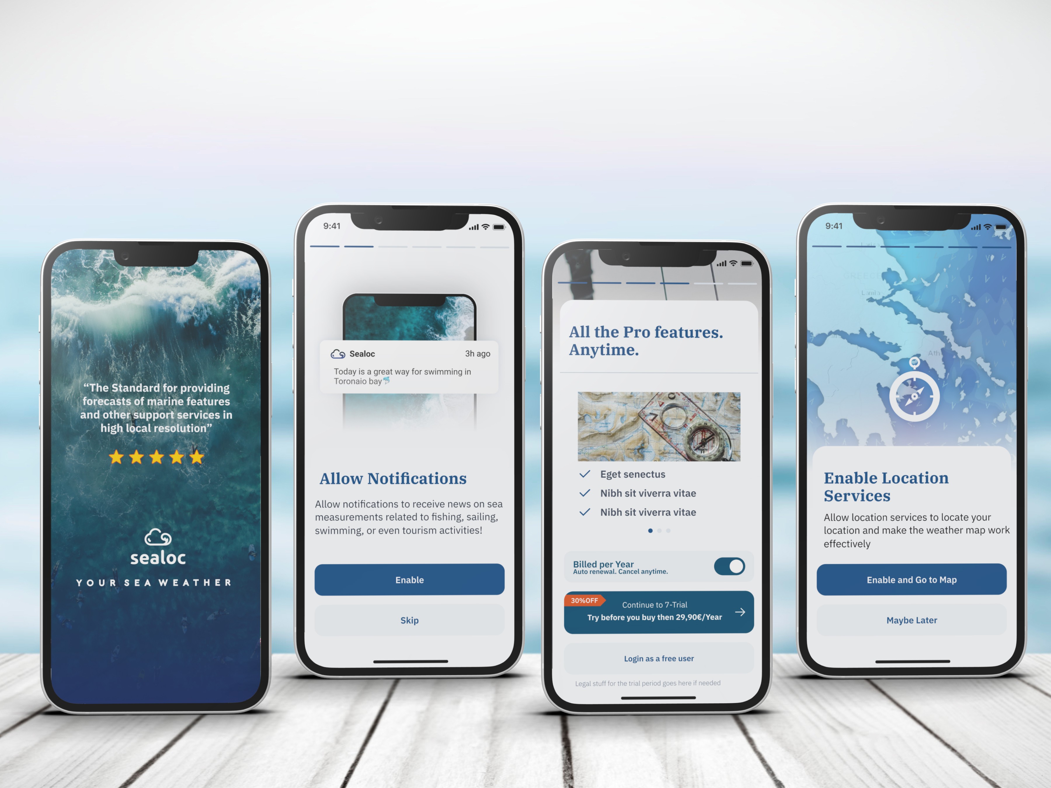
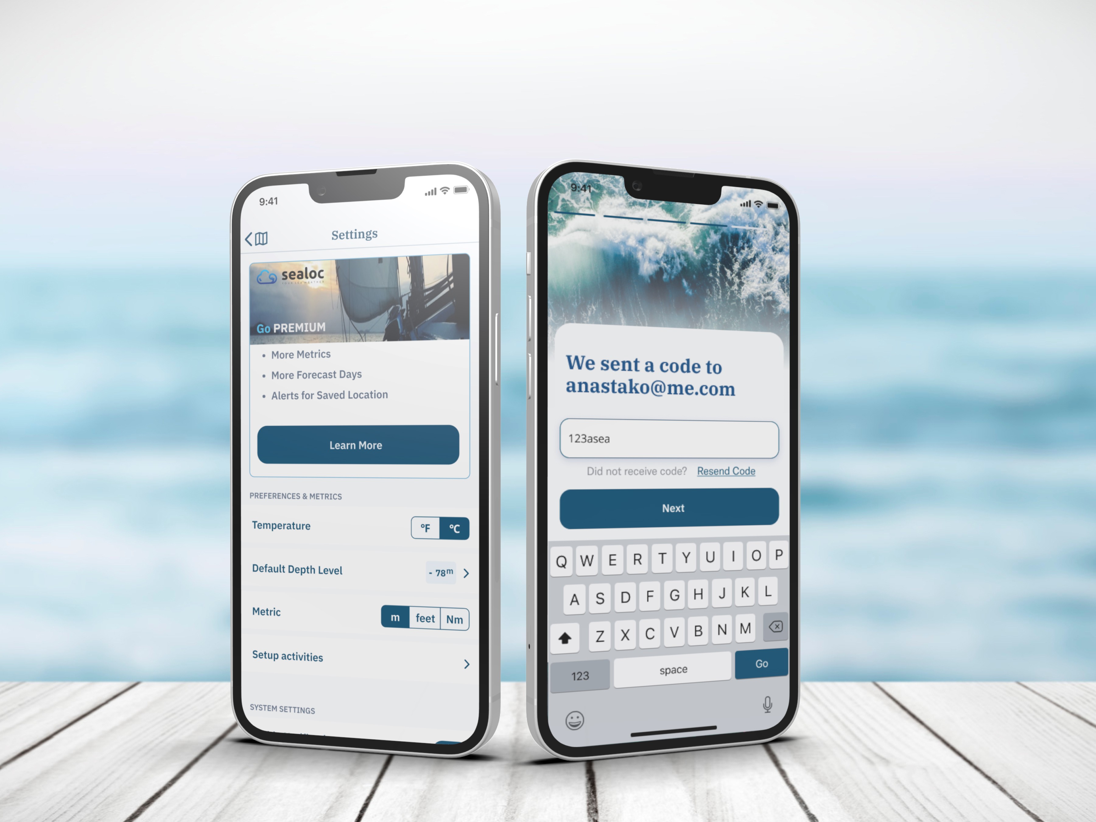
The paywall design was a critical element of the app, as it directly impacted the monetization model through user subscriptions. To ensure its effectiveness, the paywall was meticulously tested with user groups. This testing allowed us to refine the design, optimizing conversion rates and ensuring the subscription process felt natural within the overall user flow.
The paywall was strategically integrated into the app’s user journey. By teasing users with blurred data, we created intrigue and a sense of “unlocking” premium content. This approach was designed to spark curiosity, encouraging users to explore the app’s full potential and ultimately subscribe. By blending the paywall into the flow, it felt less intrusive and more like a natural step in the user experience.






The Impact
The design delivered exceptional results, positioning the app for strong monetization through its carefully crafted user experience and seamless paywall integration. Stakeholders were thrilled with the outcome, particularly the balance between data visualization and usability, which is crucial for retaining paying users and driving subscriptions. Positive feedback from user testing further validated the design’s effectiveness, particularly the ability to engage users without overwhelming them.
By strategically blending blurred data previews and subscription prompts, the app is set to capitalize on user interest, converting free users into subscribers and boosting revenue streams. This thoughtful approach to monetization is expected to significantly enhance the app’s profitability once launched.
On a personal level, this project deepened my expertise in data visualization, charts, and heat maps, and I gained valuable insights into how users interact with digital map products. Testing and observing user behavior allowed me to refine my skills in delivering just the right amount of information, avoiding information overload while maintaining clarity.
Working as part of a cross-functional team also sharpened my communication skills, ensuring seamless collaboration between design, development, and stakeholders to achieve a unified product vision.
Client Feedback
We selected to work with Konstantinos for the development of the UX/UI design of an innovative wild fire prevention & safety App for a client of our company, Groovyenie PC. From the project on boarding, the solutions he provided to the client's project, the personas isolation to the wireframing and UX/UII, plus the unique and smart features he suggested for the App, which were later added to the App, lead us to deliver a really unique & most beautiful result to our client. During the whole process of the project, he teamed up with smooth and outer professional way with the client's programming team & project manager, leaving a feeling of consistency and reliability. For our next project, he would be the person to work with without further hesitation
Christos Katramados CEO & CoFounder at GroovyGenie.com
